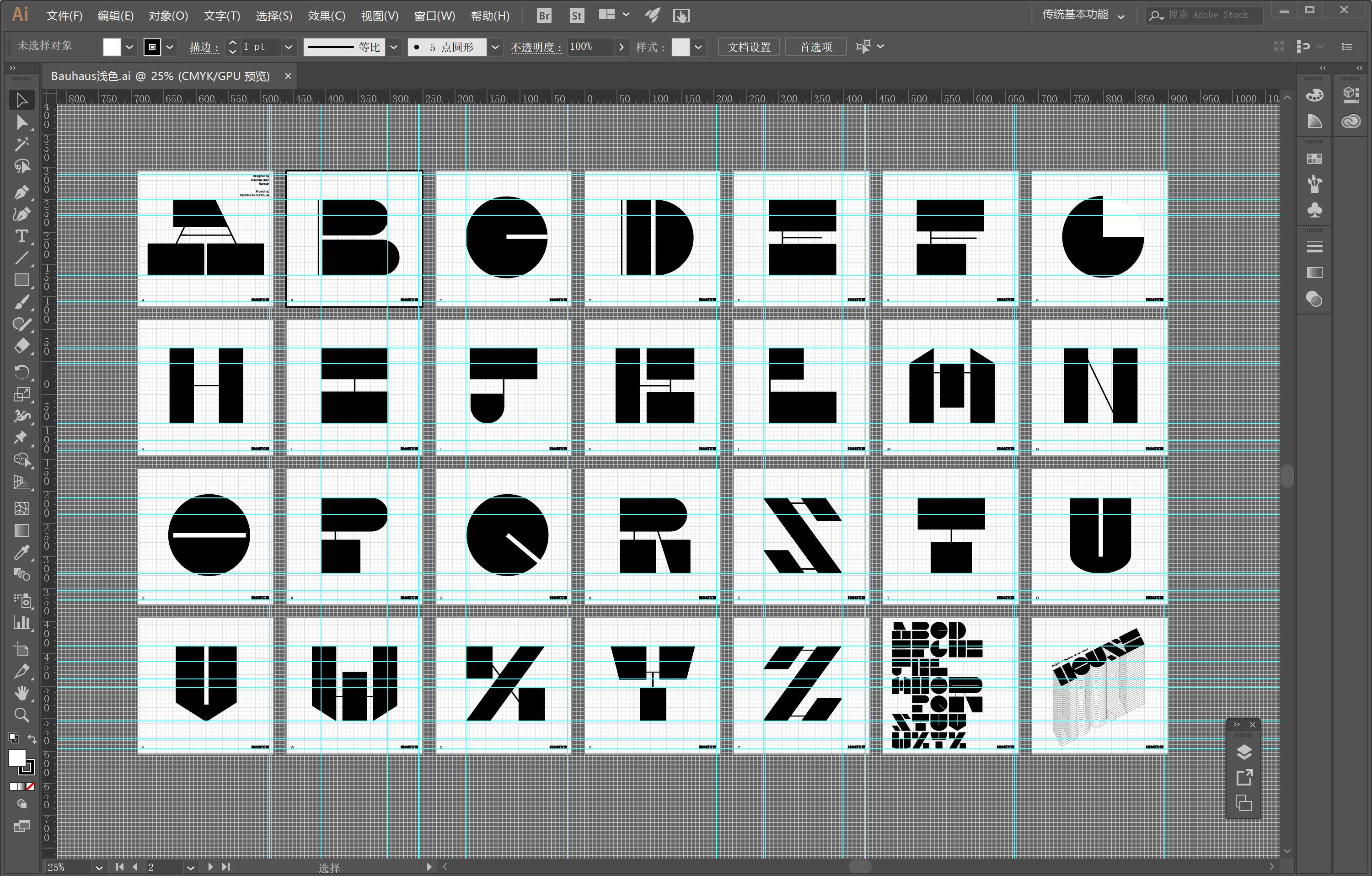
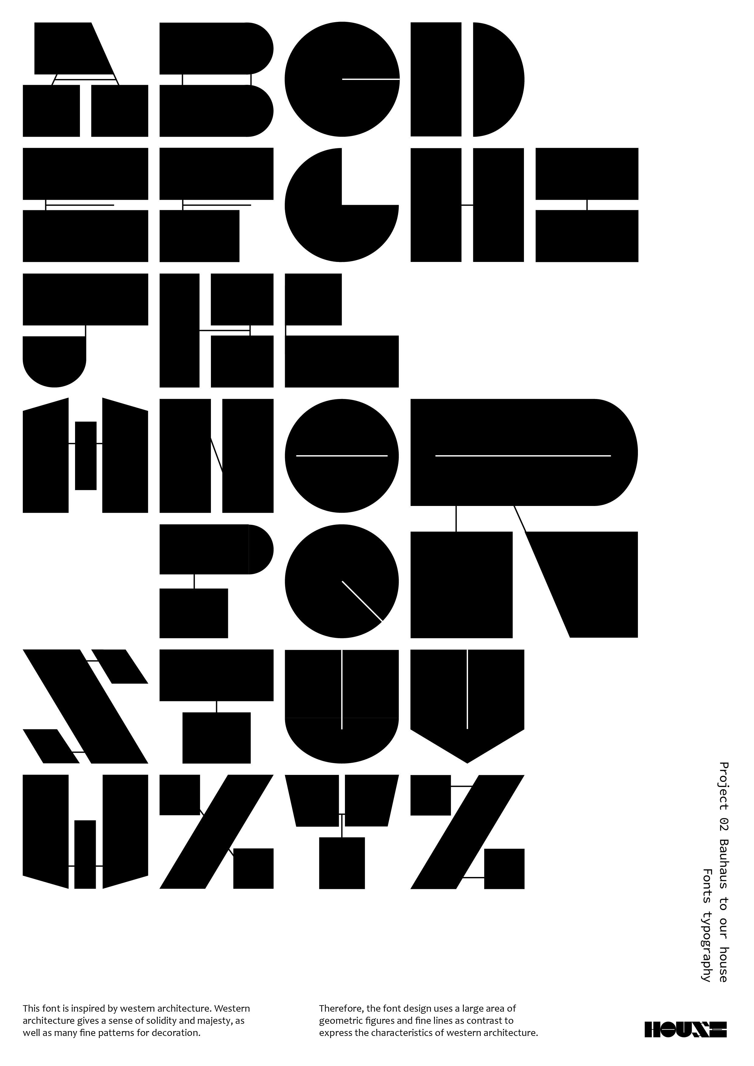
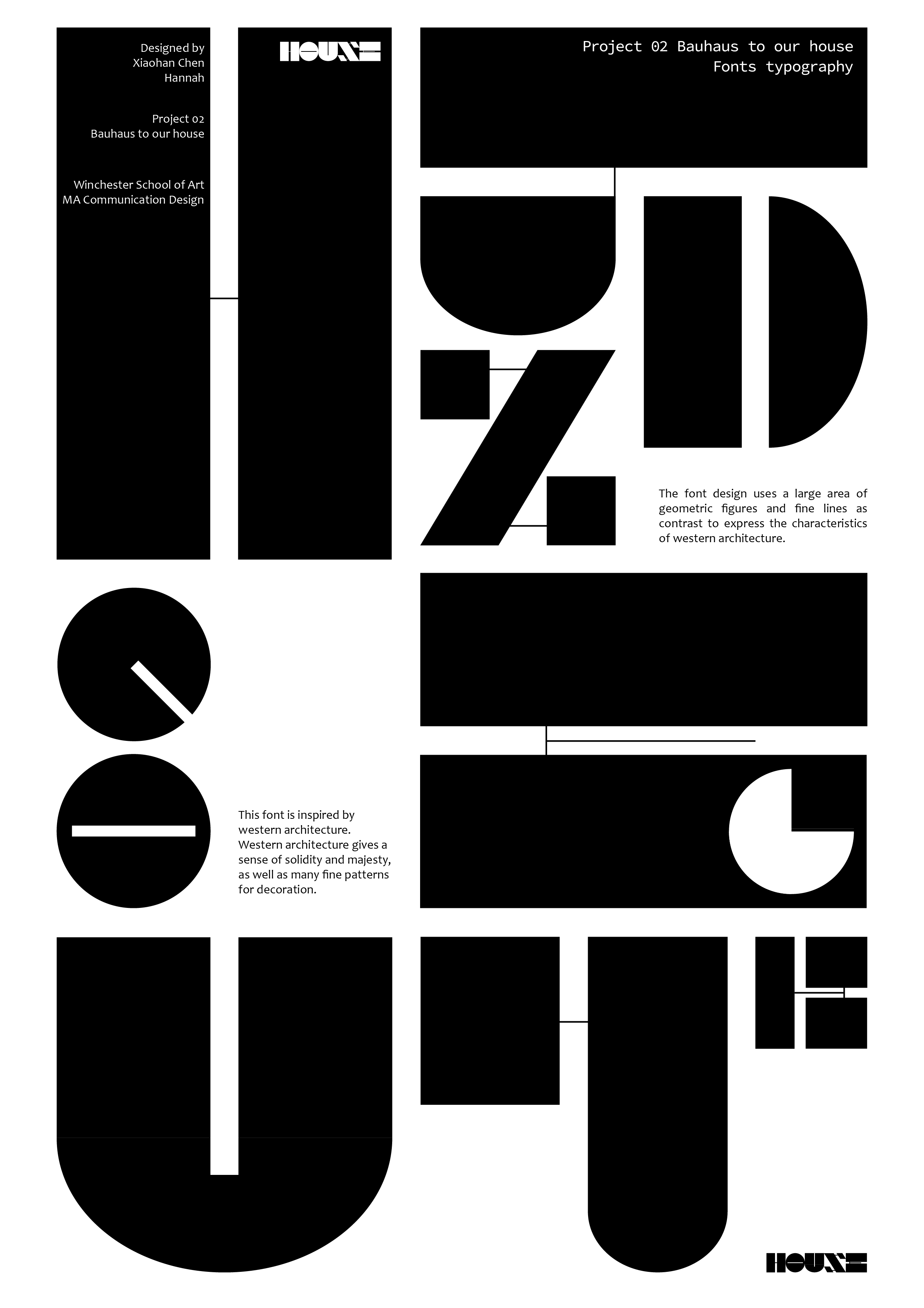
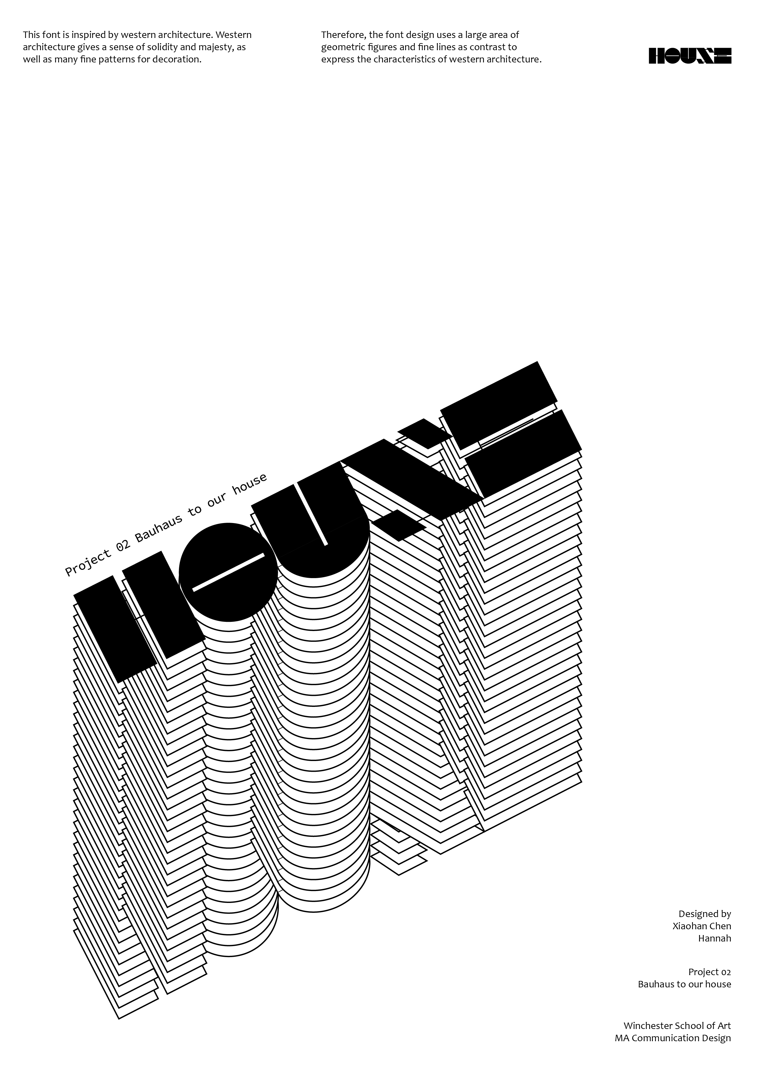
I’m doing font design for the second project. Because the theme is Bauhaus to our house. When I was brainstorming at the beginning, I thought that house can also understood as architecture. This font is inspired by western architecture. Western architecture gives a sense of solidity and majesty, as well as many fine patterns for decoration. I also researched some information about Bauhaus. Bauhaus’s design pursues simplicity and design is composed of geometric shapes. Therefore, the font design I uses a large area of geometric figures and fine lines as contrast to express the characteristics of western architecture.
Through Thursday’s tutorial, Jackie gave me the advice that font design needs to be more rigorous and precise, to master the balance and recognizability of the font, and to constantly test the usability of the font. Because I only designed capital letters, Jackie thought it was just the beginning. I need to complete this series of typefaces with lowercase letters, numbers and symbols. Then test it and make the poster layout after the font design is mature, making it more interesting and playful.
My modification plans:
complete the whole font design and only focus on one series of font design. Because the previous idea was to make two series of fonts, but it made me a little overwhelmed. I need to focus on one and do it well.
Continuous font testing makes fonts size, arrangement and font features to be consistent.
Visual typography after the font is completed, making the font more playful.
It is also important to determine how the font is to be used, such as under what circumstances the font can be used and what role it can play.
This week’s blog content is to write a short summary introduction project 2 – house. I will use the headings below to frame my project plans.
1. Working title of your project
Font design combined with the characteristics of Eastern and Western architecture.
2. Why
Your reasons and motivation for undertaking this project
Font design, because last week’s font workshop, we tried to design a complete set of fonts, I feel very interesting, so I want to use it in this project.
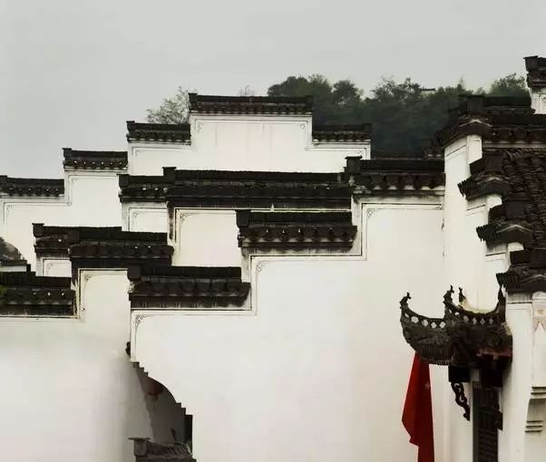
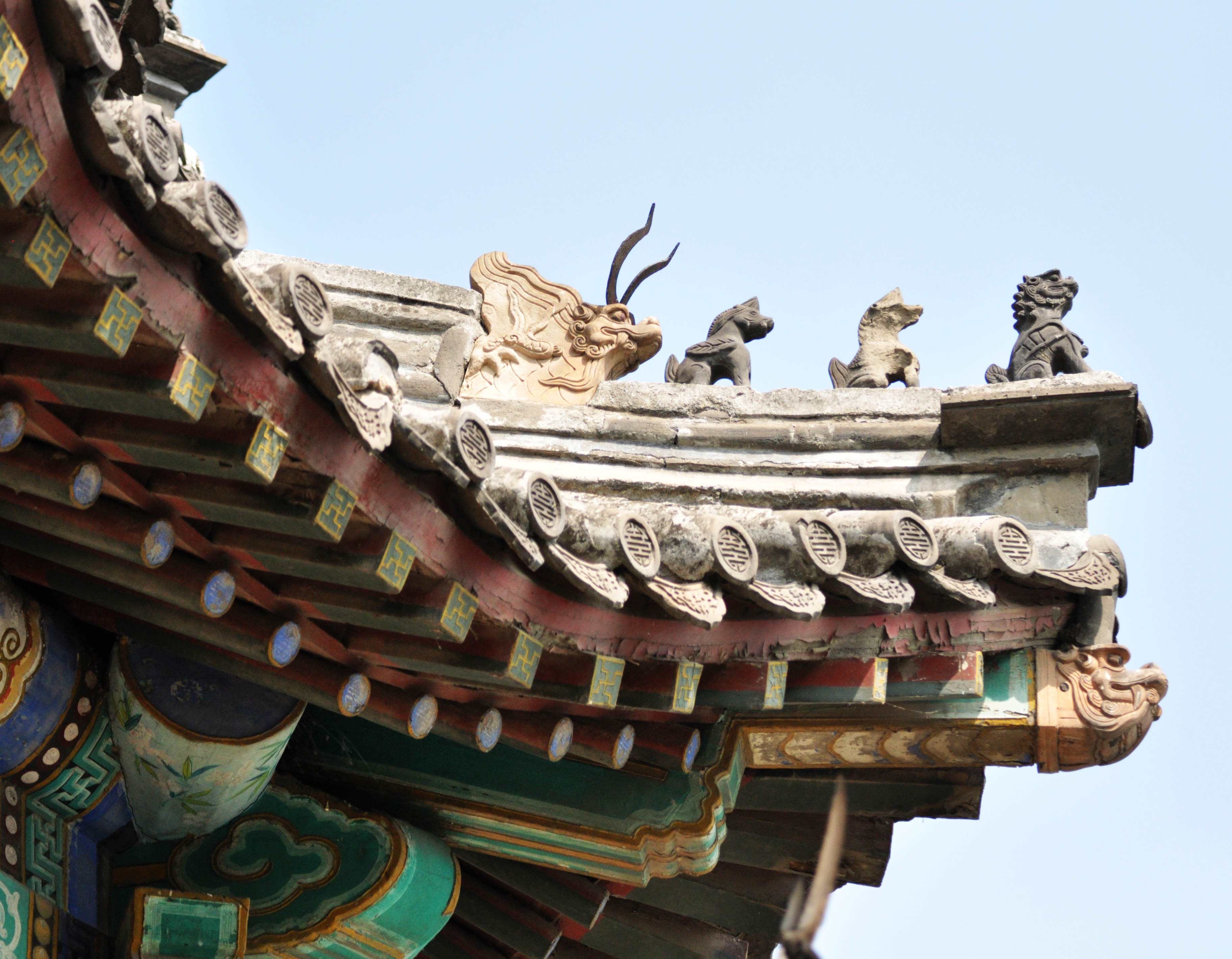
Since the theme is house, I want to apply the characteristics of Chinese architecture to font design. The roofs of ancient Chinese houses were curved and decorated with decorative patterns, it can be used as a source of inspiration for font design.
Through tutorial, Danny gives suggestions to design fonts by comparing Eastern and Western architecture. I think it is a good ideal.
Research
Resaerch
3. What
Your intended outputs for the project
Two sets of font design, typesetting to make a booklet.
Research
Research
4. How
The methods, approaches and media you intend to use to produce your outputs.
Grid system is used for font design and book typesetting.
If time allows me to use code to make moving posters.
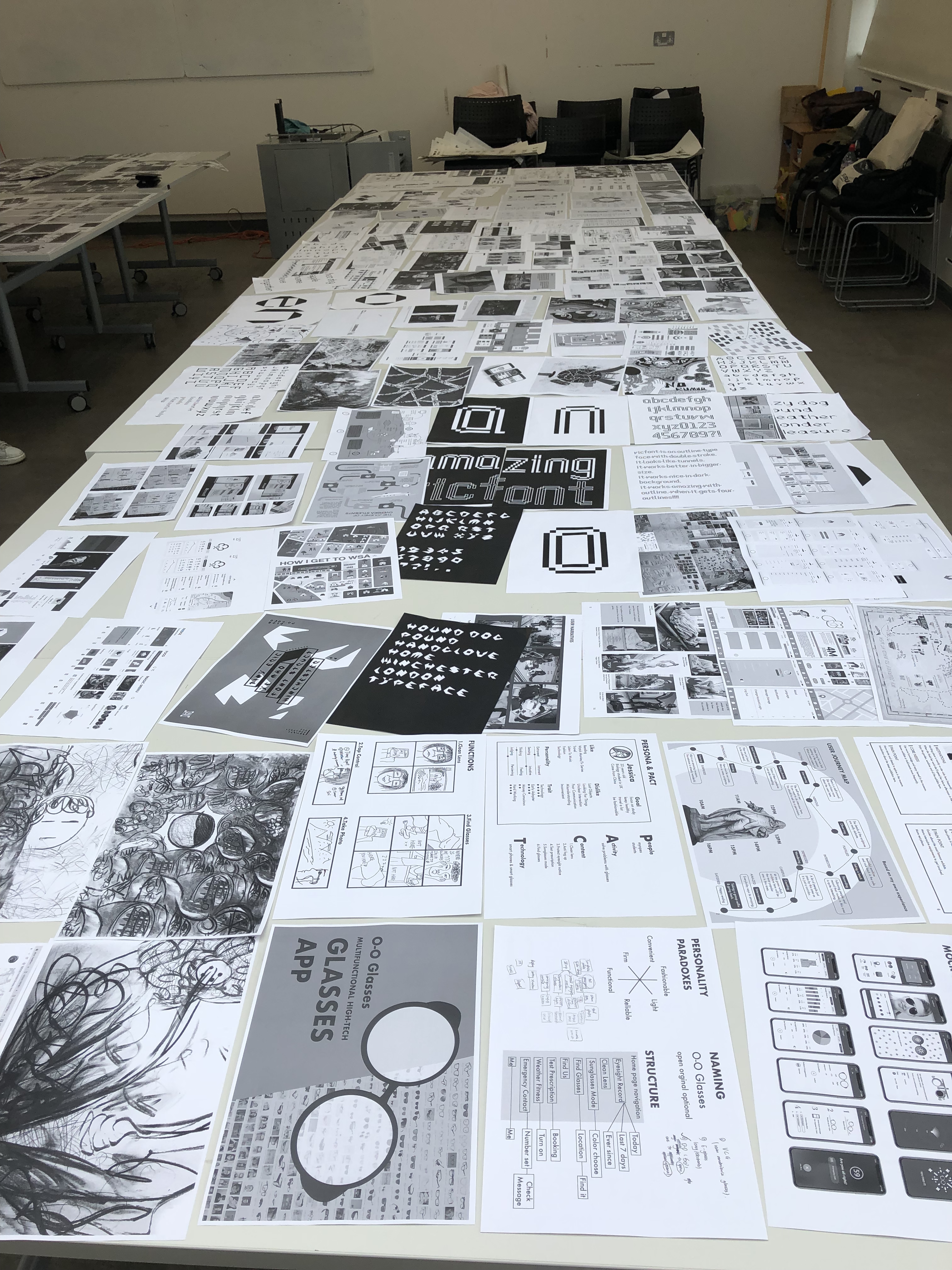
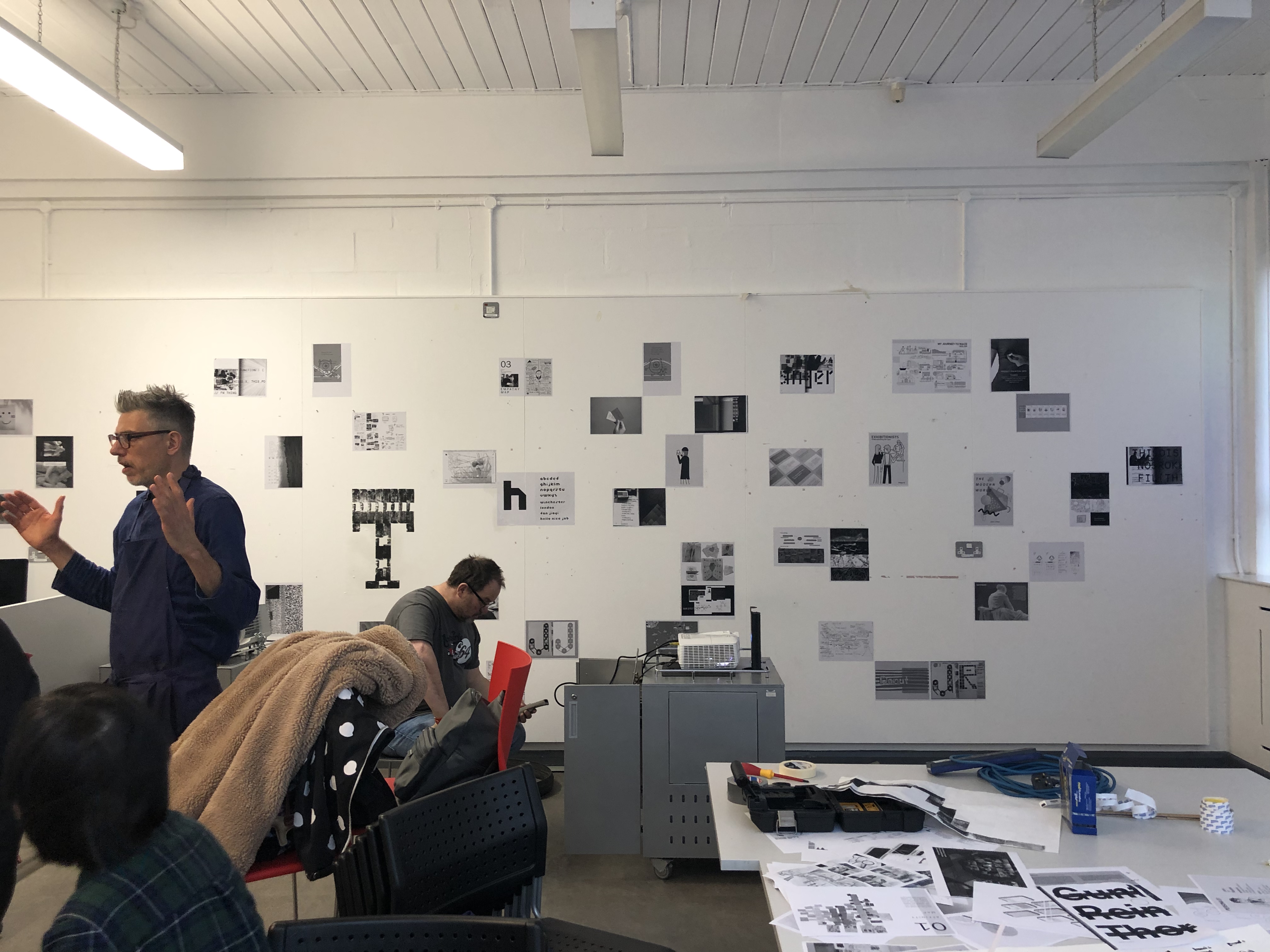
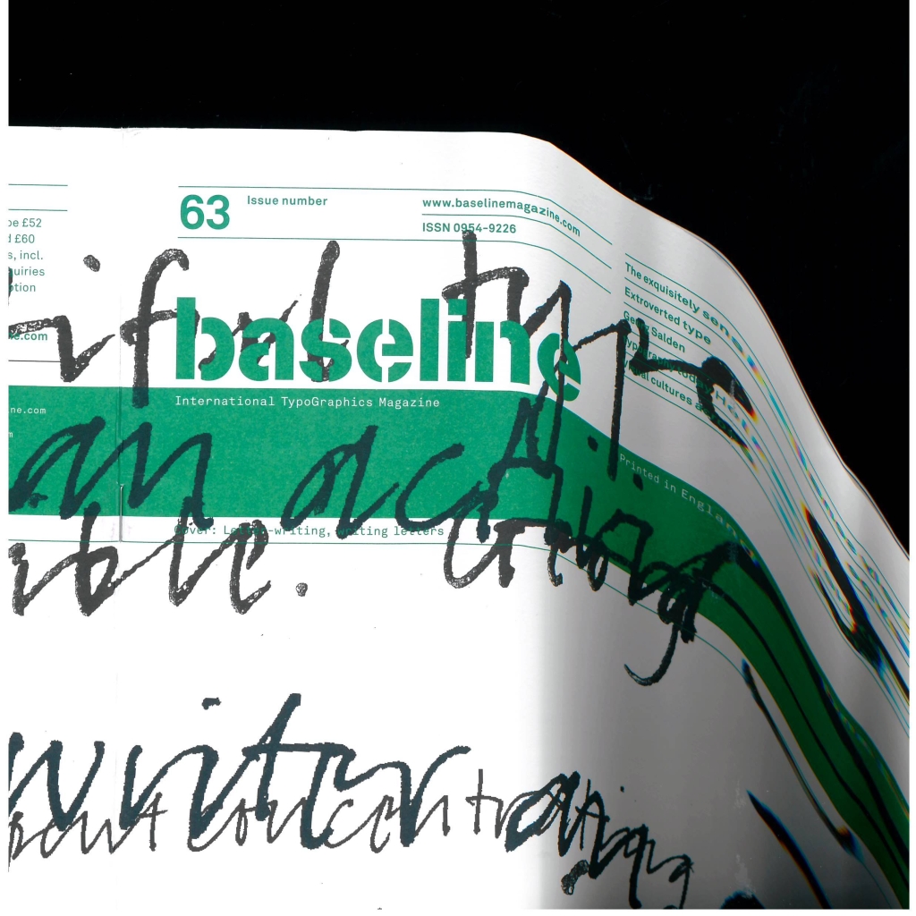
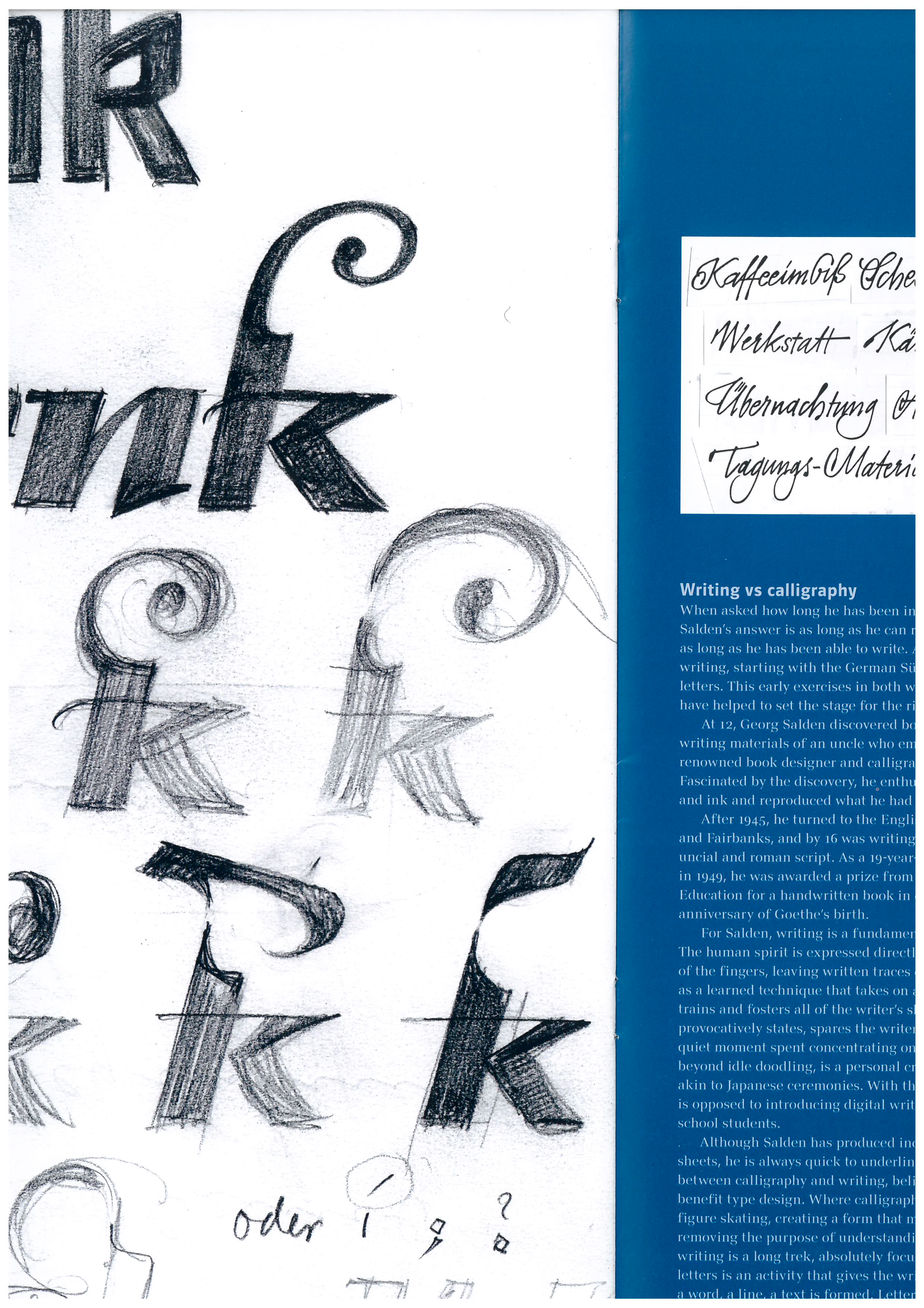
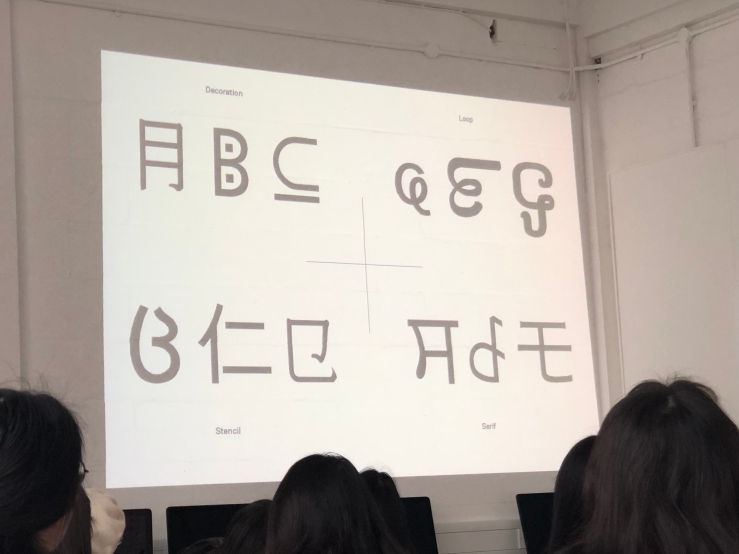
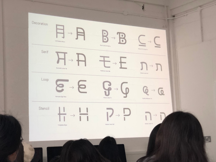
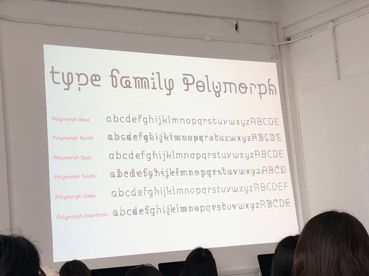
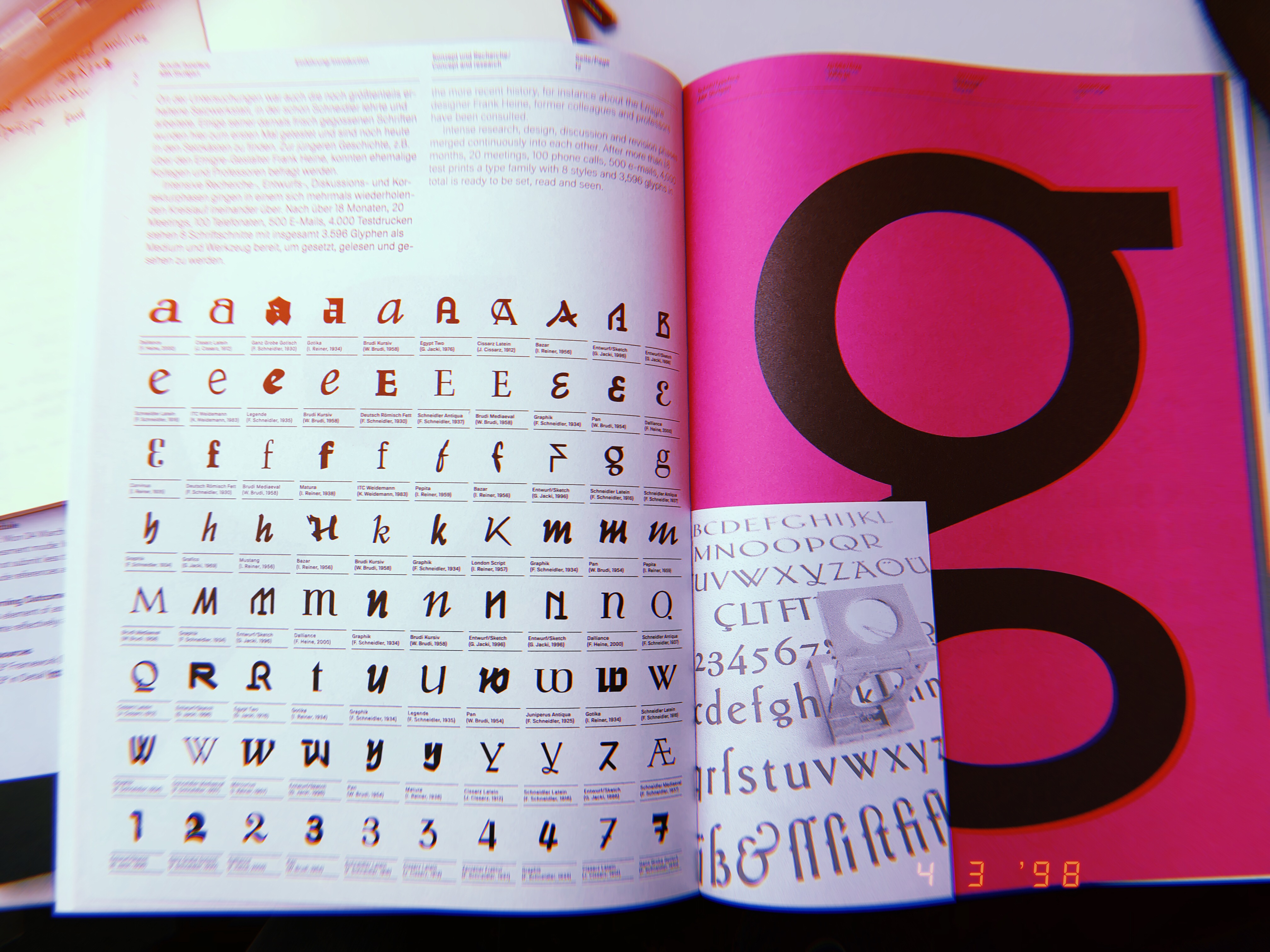
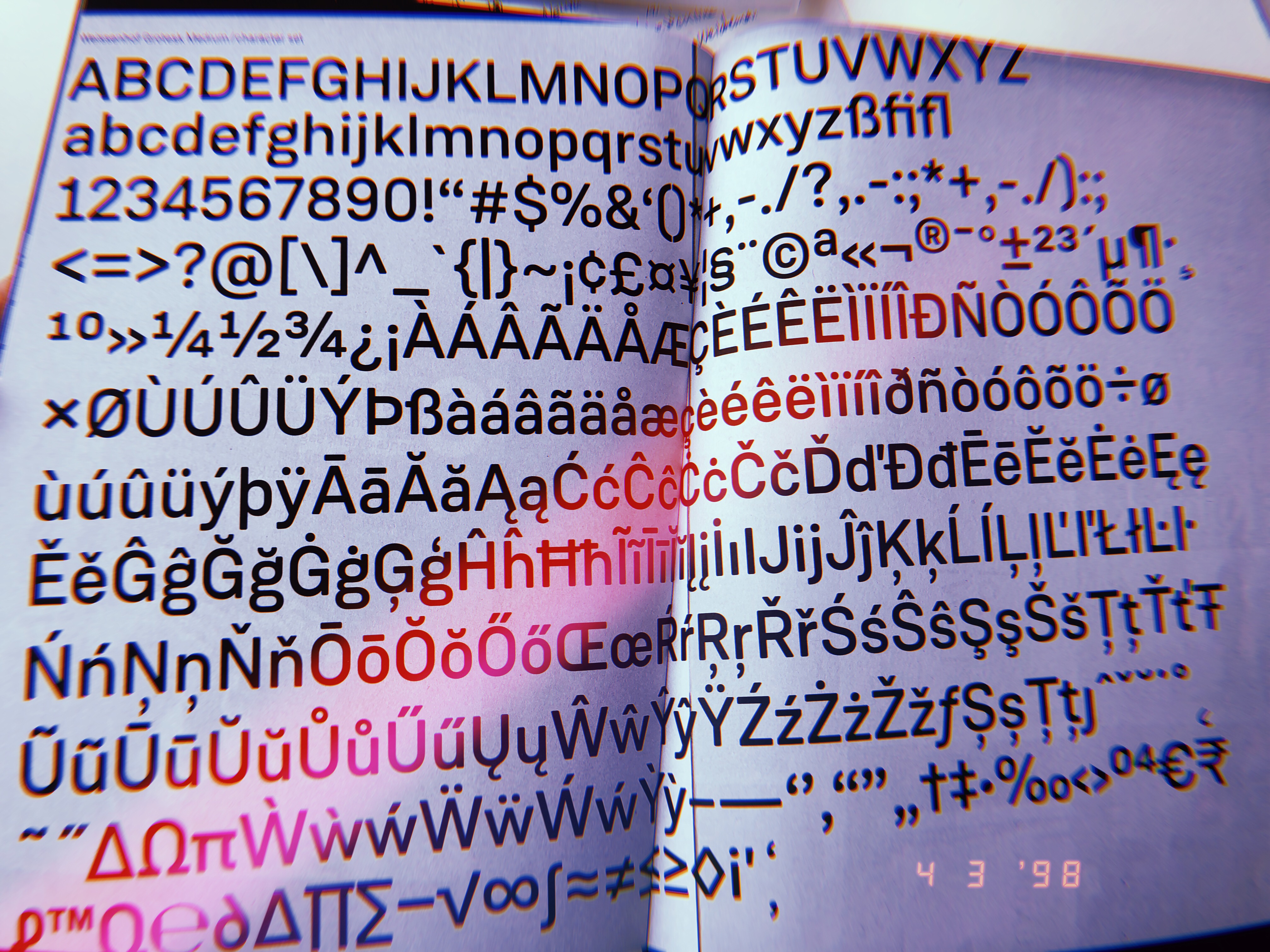
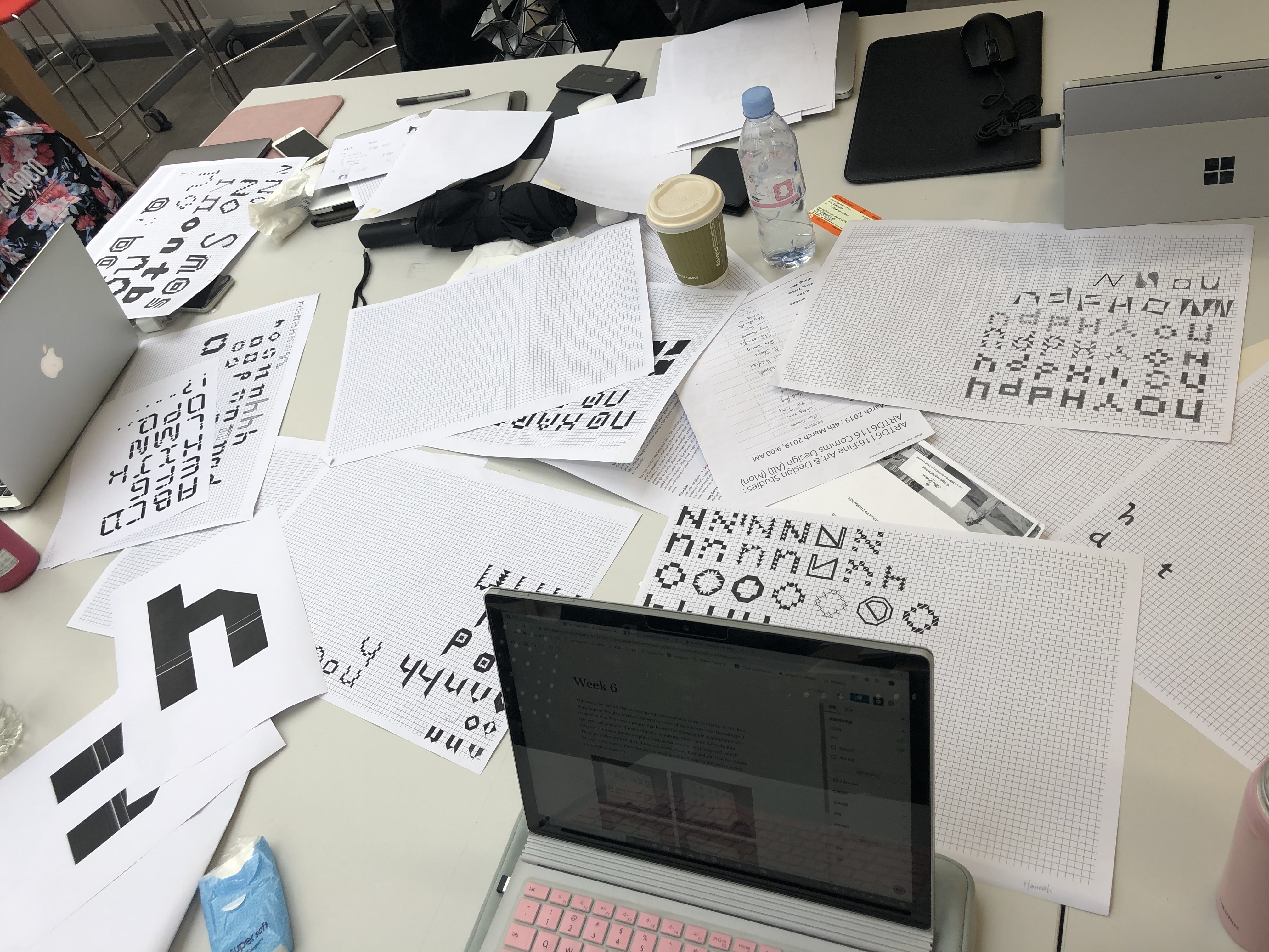
This week, we had a 3-day workshop with two teachers from Germany. At the first workshop on Monday, teachers showed us some of their projects on font design. I remember that there was a project that looked for typographic inspiration from the texts and graphics of many different countries. Then, make different font categories through similar graphics, such as decoration, serif, loop and stencil. Then use polymorph to open the mind, select a basic font and put it in the center. Change some details, these details are small graphics found in the previous text and graphics research. As a result, a lot of special fonts have been developed. They have similarities and uniqueness at the same time.
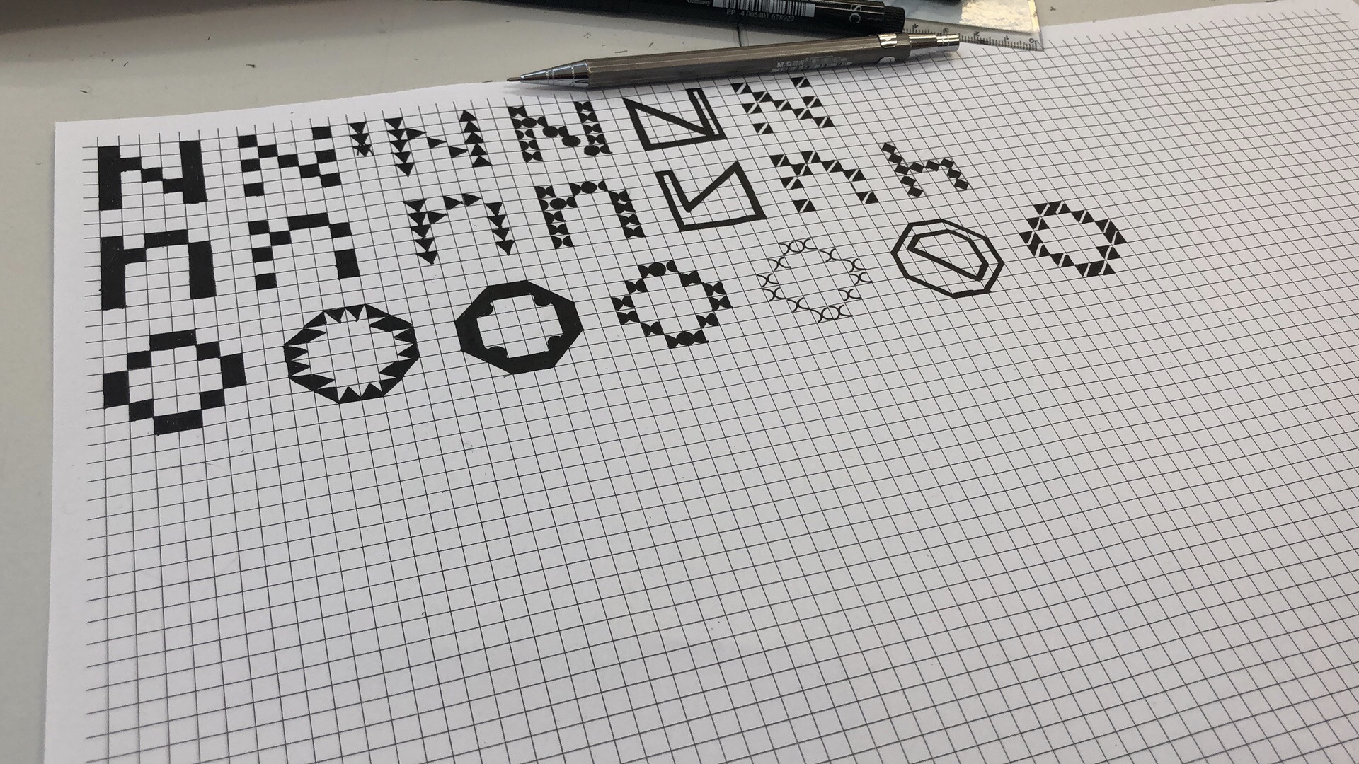
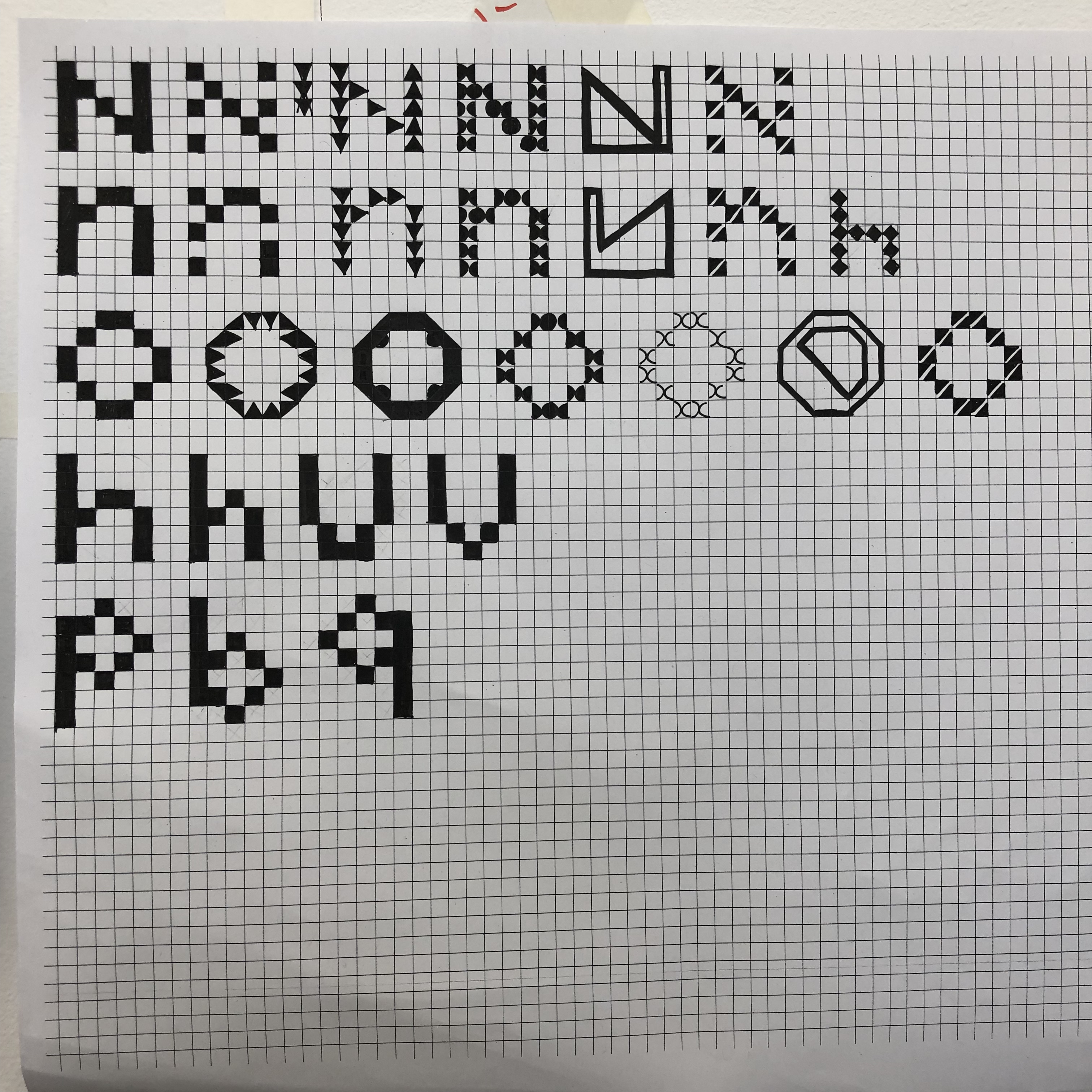
Then in the following workshop, we used paper with small squares to make a sketch design of fonts. At first, teachers asked us to design from ‘n’ and ‘o’, because these two letters can be easily developed into other letters, such as ‘h’ ‘p’ ‘q’. I feel very interesting.
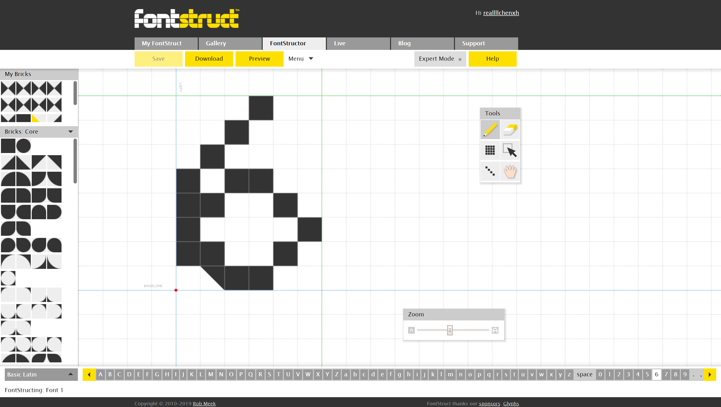
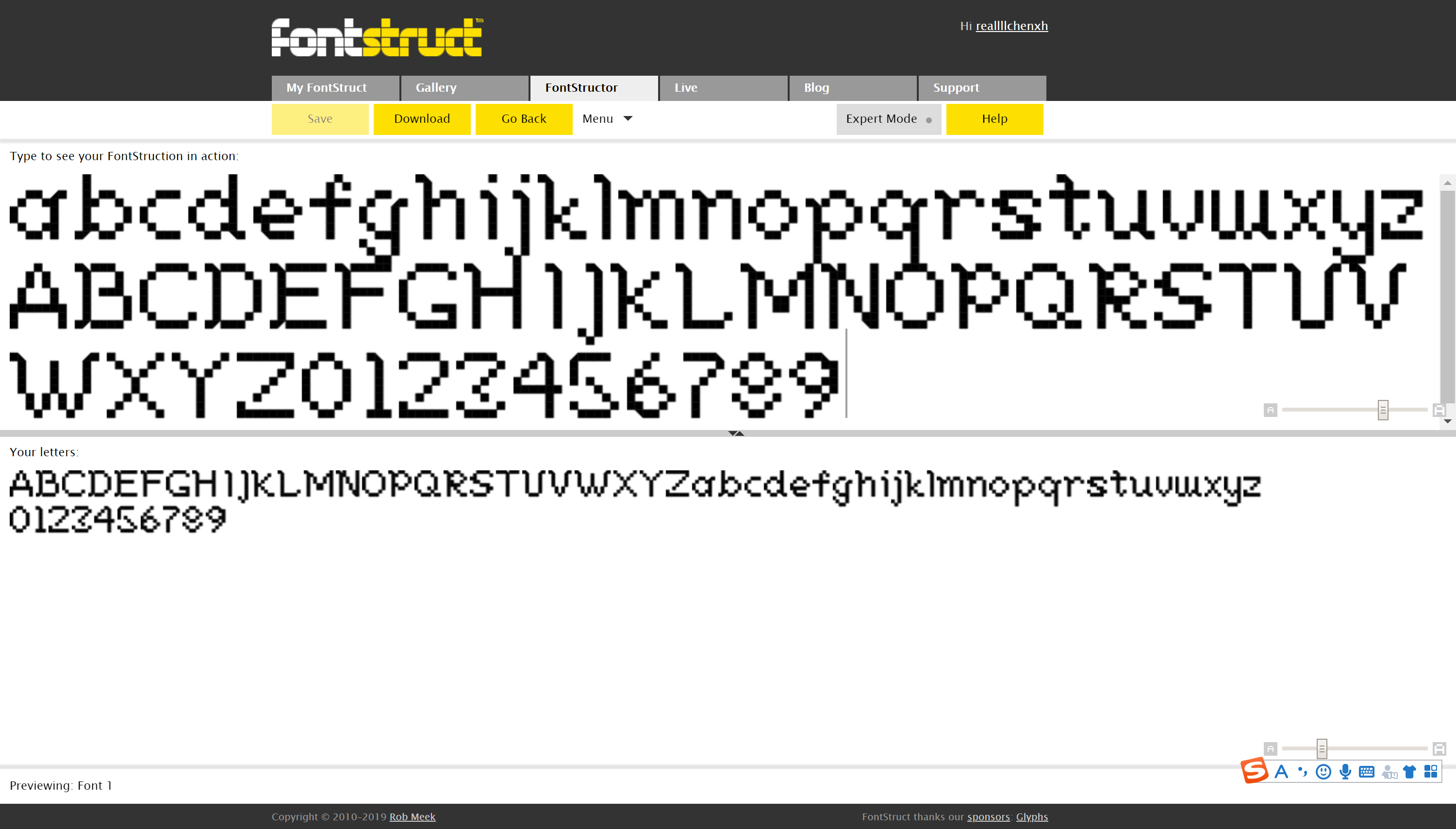
In the workshop on the second day, the teacher introduced us a font design website called Fontstruct. We can use this website to develop Monday’s sketch into digital. Because the website has grids and different graphics, we can organize and vary and easily modify.
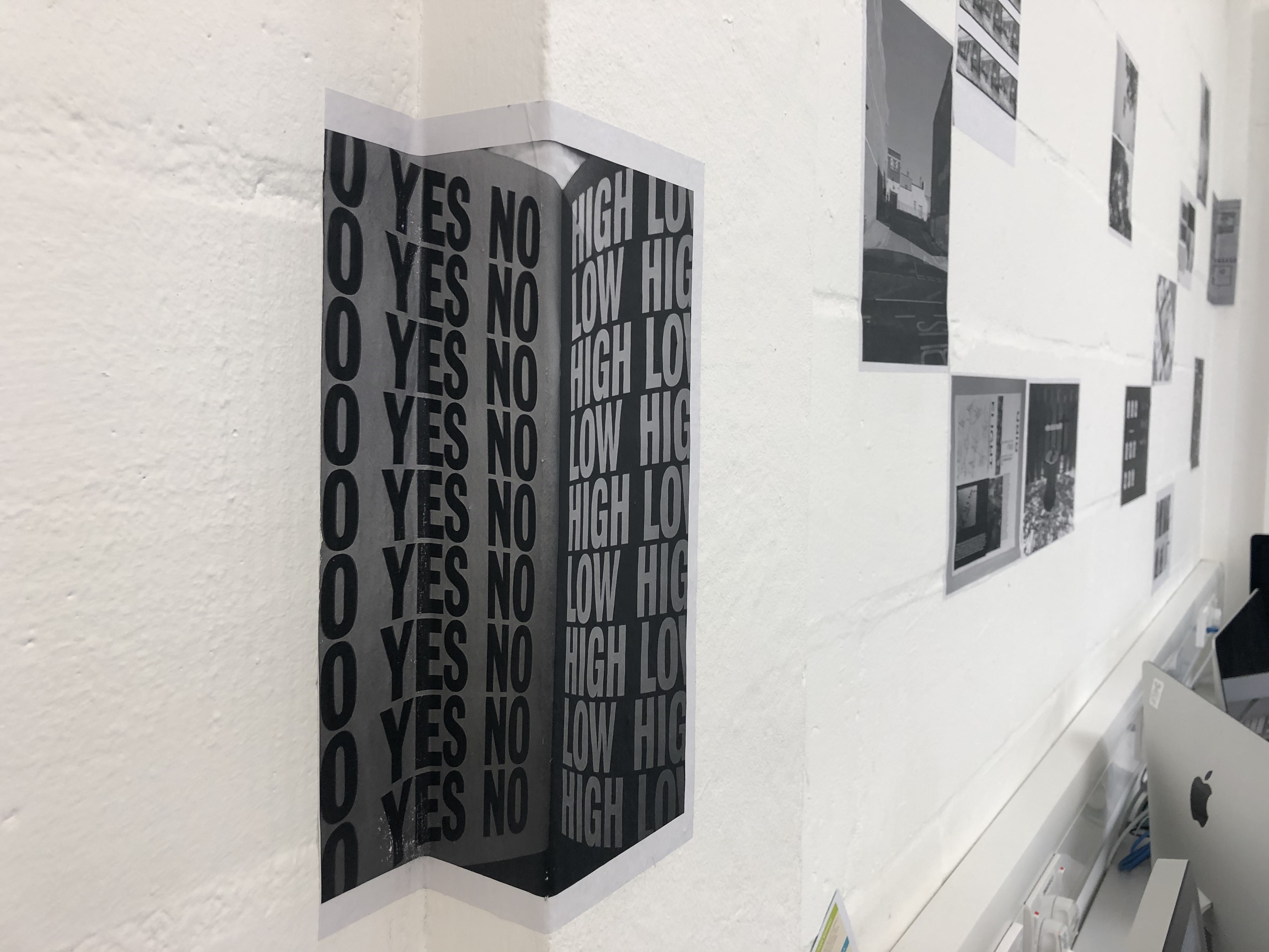
In the last workshop on Wednesday, we printed the fonts in black and white and pasted them on the wall. The overall effect was very good. My font is inspired by Mosaic, in addition, some triangles were added to the right angle, which played a curving role. It was my first experience to make a whole set of fonts by myself, and I learned some knowledge about fonts, which gave me a great sense of achievement.
This week we visited the Design museum and Japan house in London. And we also got the brief of our second project, which is about house.
In the design museum’s Home Futures exhibition, designers and architects in the 20th century displayed their fantasies and predictions for the future Home.
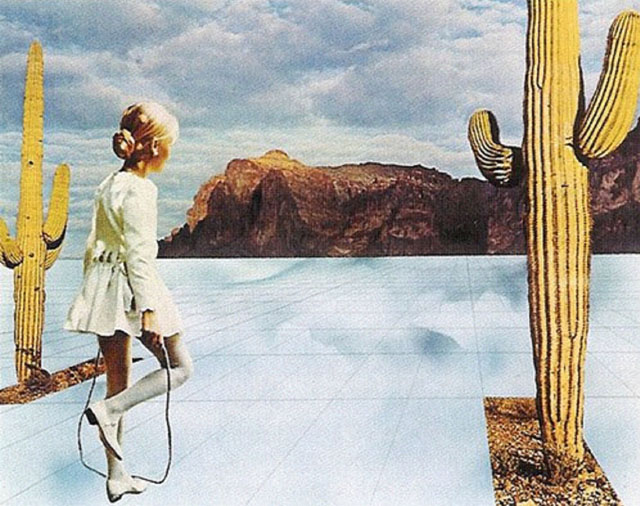
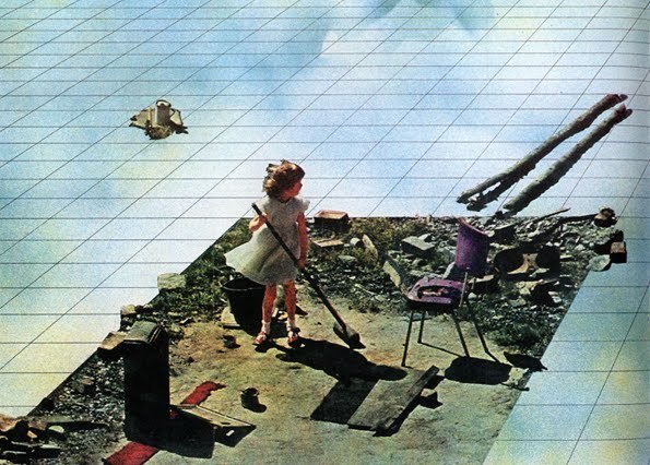
1.In this design called Supersurface, the designer used collage to create a series of grid systems. It’s a global, invisible grid that connects everyone. People in this environment are free and completely equal, they don’t need to work and have no property.
This utopian design idea originated from the designer’s criticism of the society at that time.
Adolfo Natalini, one of the founders of Superstudio, wrote in 1971 “…if design is merely an inducement to consume, then we must reject design; if architecture is merely the codifying of bourgeois model of ownership and society, then we must reject architecture; if architecture and town planning is merely the formalization of present unjust social divisions, then we must reject town planning and its cities…until all design activities are aimed towards meeting primary needs. Until then, design must disappear. We can live without architecture…”
Superstudio (1971) in Life Without Objects, ed Lang and Menking. Milan: Skira, 2003.
What attracted me to this design was the breakthrough of his idea. At a time when others are imagining all the conveniences that technology will bring to our lives in the future. But he imagined an alternative model for life on the earth. Because a lot of the imagination of the past in the exhibition has been realized through technology, but the expectation of a future society in which the world is divided into grids and everyone is equal and does not need to work is not realized, and the future is hard to achieve I think. But all the design activities that designers want are aimed at meeting basic needs, which reminds me of human-oriented design. Understanding the needs of users and empathy, this concept is followed by contemporary designers. At the same time, this design made me consider the theme of house in project 2, and I could also breakthrough of my ides to think about the house in the future from another perspective like him. Don’t limit myself to technology. Also can imagine different lifestyles.
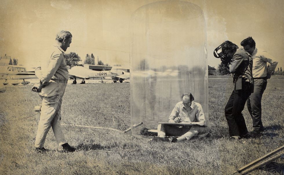
2. In 1969, Hans Hollein proposed a mobile office in the form of a transparent bubble. It’s a place where you can have your own space anytime and anywhere. He keeps everything in his suitcase, inflates it when he needs it, also has all the tools in his transparent mobile office, and can make phone calls.
This design is similar to the one described above, because design has the characteristic of nomadic lifestyle. The concept of a carry-on house came from the lifestyle of the time, and the designer also introduced the idea of a house that could be folded into a suitcase.
I like this idea, because it provides a private and special space for people. It’s both physical and psychological protection. Isolate people from inhospitable environments and create a working environment that is free from outside interference. And the idea of putting the house into a suitcase, if it can be realized, can solve people’s dependence on home.
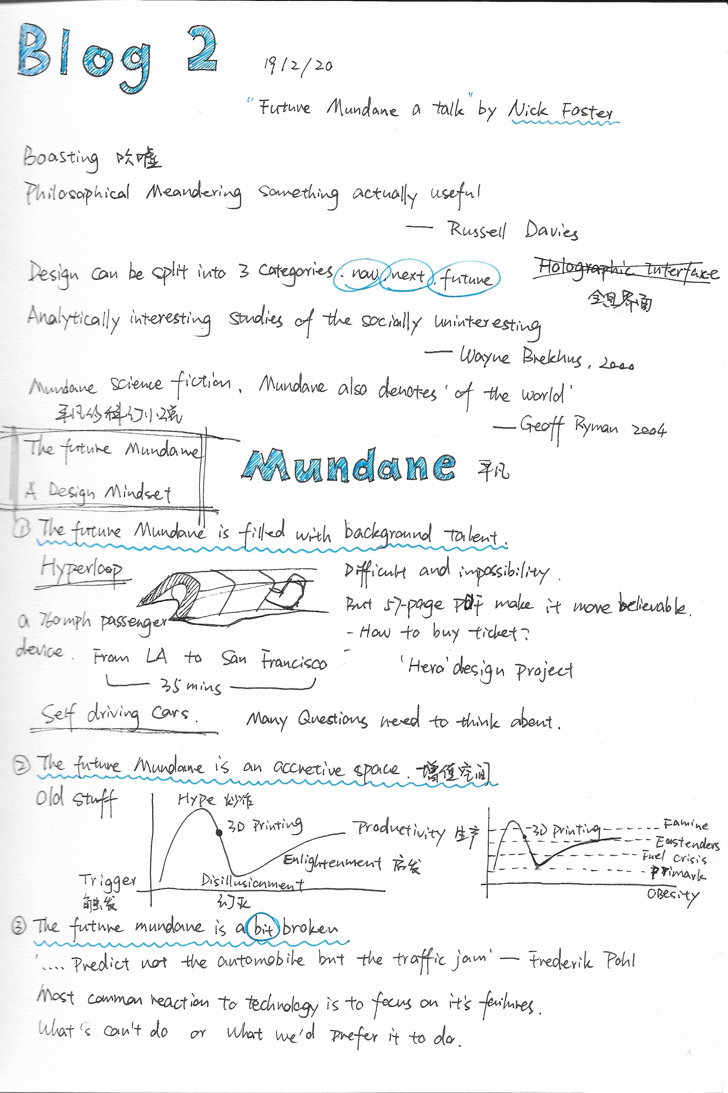
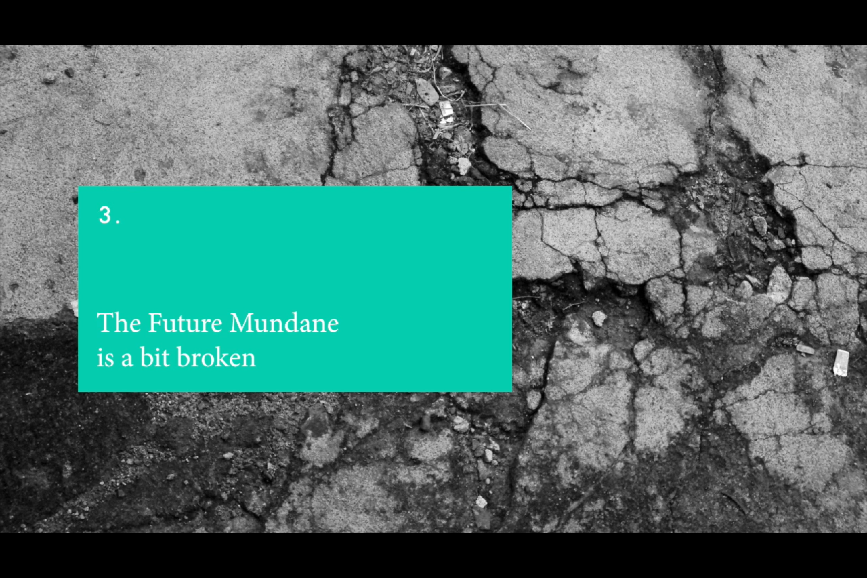
In this speech, the speaker said that the design projects can be divided into now, next and future. Countless futuristic technologies have been created in design and other film and television creations. But the speaker proposed an idea called “the future mundane.” And explains the concept of the future mundane in three different ways.
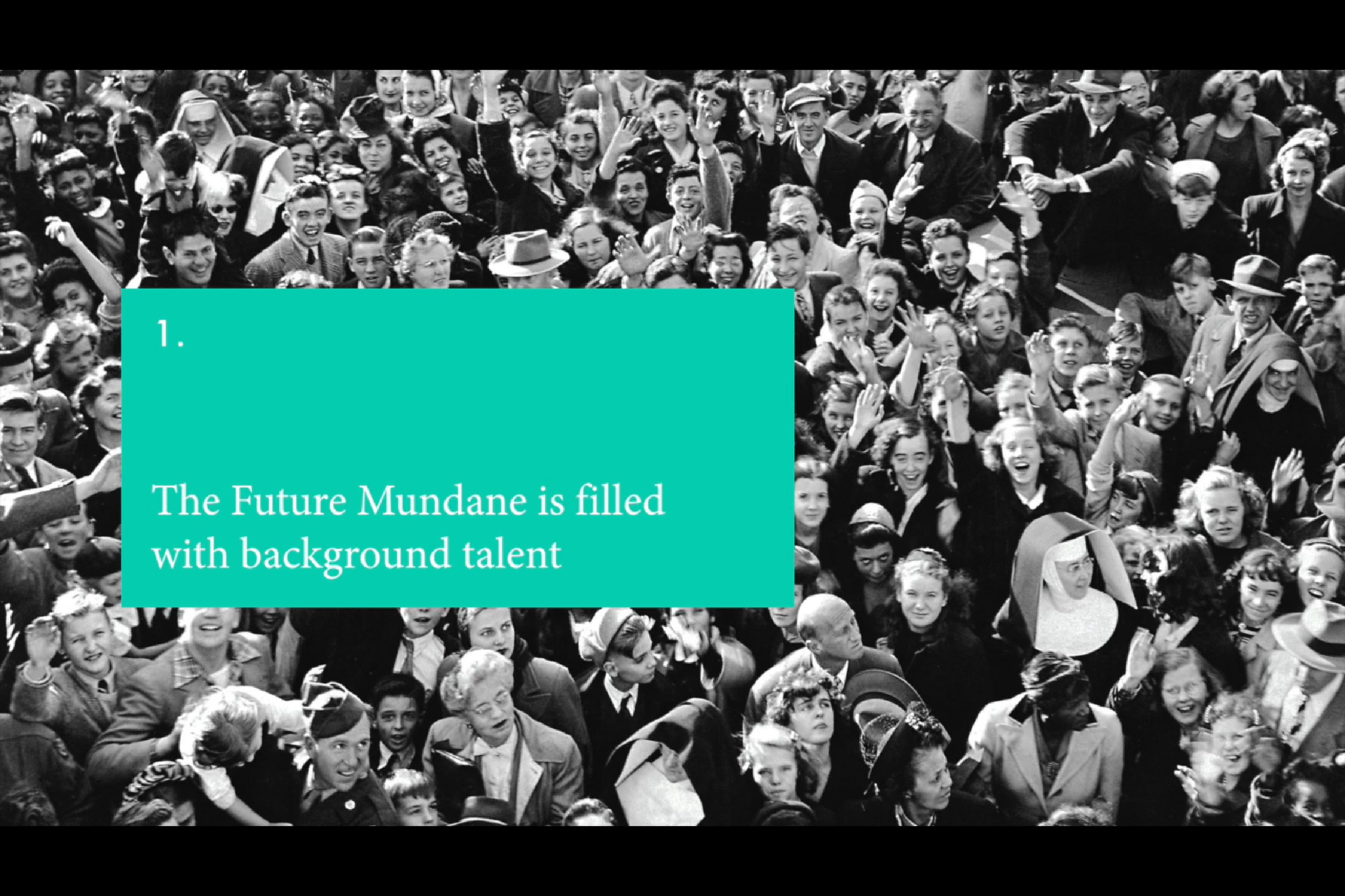
1. The future mundane is filled with background talent
Pay more attention to mundane people and things in future design. In science fiction movies, it is common to construct an environment in which the hero saves the world. But in real life people don’t have superpowers. Therefore, “hero” design project makes mundane people feel distant and lack of sense of reality. But if this design just for fun, that’s fine. If not, future design should focus on mundane characters, such as mundane people living in the world, and mundane things in daily life. That’s design can makes people feel more fun or generate more creative ideas, also more realistic.
Don’t abandon old things in future design, because old and new things coexist. Our design should constantly develop and innovate based on the existing things, instead of abandoning the existing things and blindly developing new innovations and technologies. Because “What is rational is actual and what is actual is rational” (G. W. F. Hegel). Take the essence and discard the dregs is what we need to do in future design.
Why the fascinating and magical technology of future design attractive people, it’s not just because creativity but in seeing that things will fail in the future. Technology can’t be perfect, and the most common reaction to technology is to focus on its failures. What can’t it do or what do people expect it to do. Describing the future as something slightly broken will make people pay more attention to it and have more curiosity about it. A little failure will make people understand, thus developing a more perfect future.
In the first project, my theme is to help
traumatized refugee children learn the local language. Because many refugee children
have suffered unimaginable disasters, Mental health problems prevent them from
learning properly. But for them to get a better life and future, local language
education is essential.
The final artefact will be a pop-up book, the
user group is refugee children who in need of primary education. The content of
the book is to help refugee children learn English through the combination of
pictures and words. Choose bright colours and interesting pictures make them
feel positive emotions. And make stickers with English words so that refugee
children can make their own pop-up books.
SIX WORD description of my project intentions:
Local language: better future, traumatized children
In this blog, I will use The DIEP strategy to summarize my study in the first semester.
D – Describe objectively what happened
The course name we learned in this semester is Design and New Media. At the beginning of the semester, Andy introduced different design methodologies to us.
In the first project about bike, we used 5C Mode to develop the project. First is collect information, then comprehend, and finally developing concepts and creating, it’s a group project so we need collaborate.
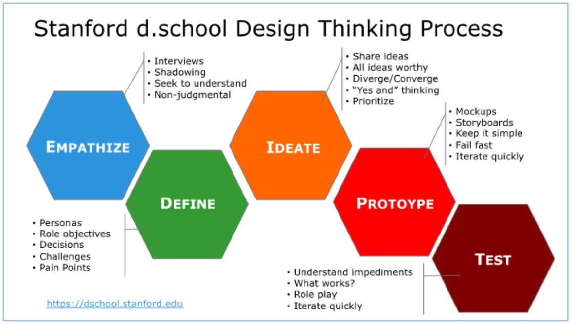
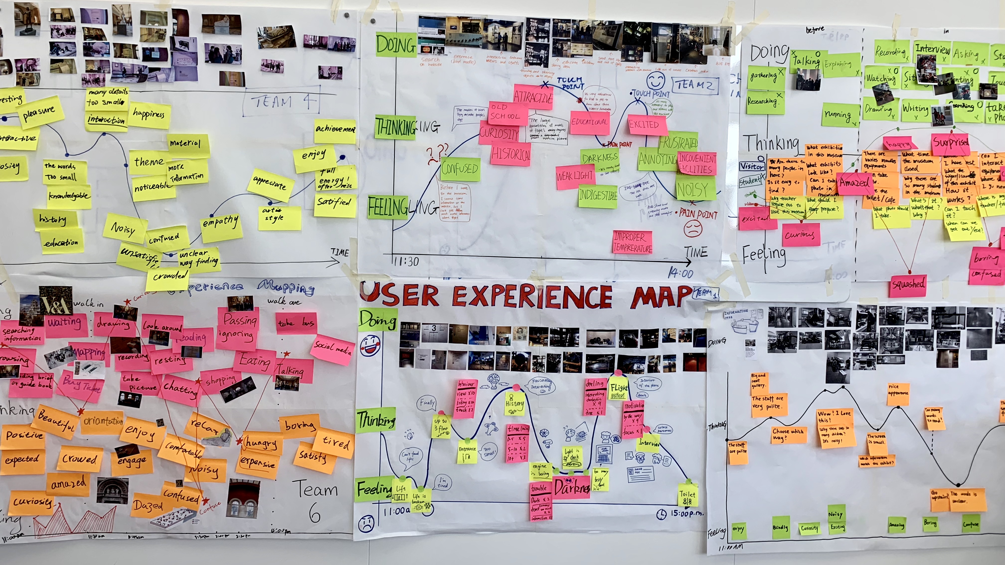
The second project name is Exhibitionists is related to the user. We went to the science museum to collect user information, which was a good experience. In this project we learned about how to make personas and user experience map, also to understand the User Centred Design, studied the PACT (Particular PEOPLE carry out particular ACTIVITIES in particular CONTEXTS using particular TECHNOLOGIES). Through the study of the second project, I know that design needs to pay attention to the emotional experience of users, establish empathy, and understand what kind of experience users want through design.
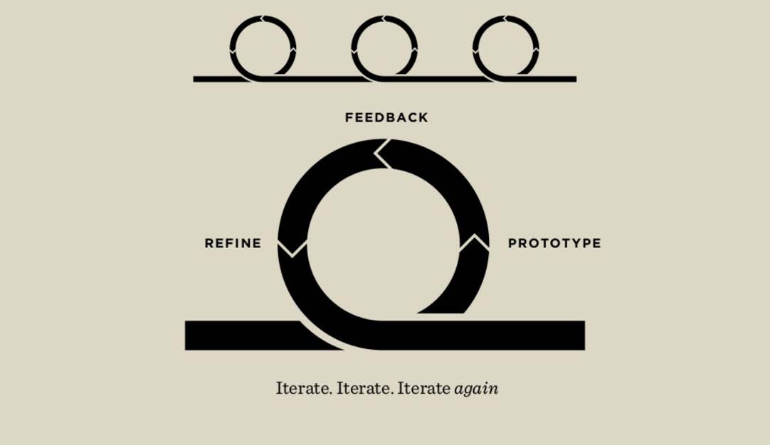
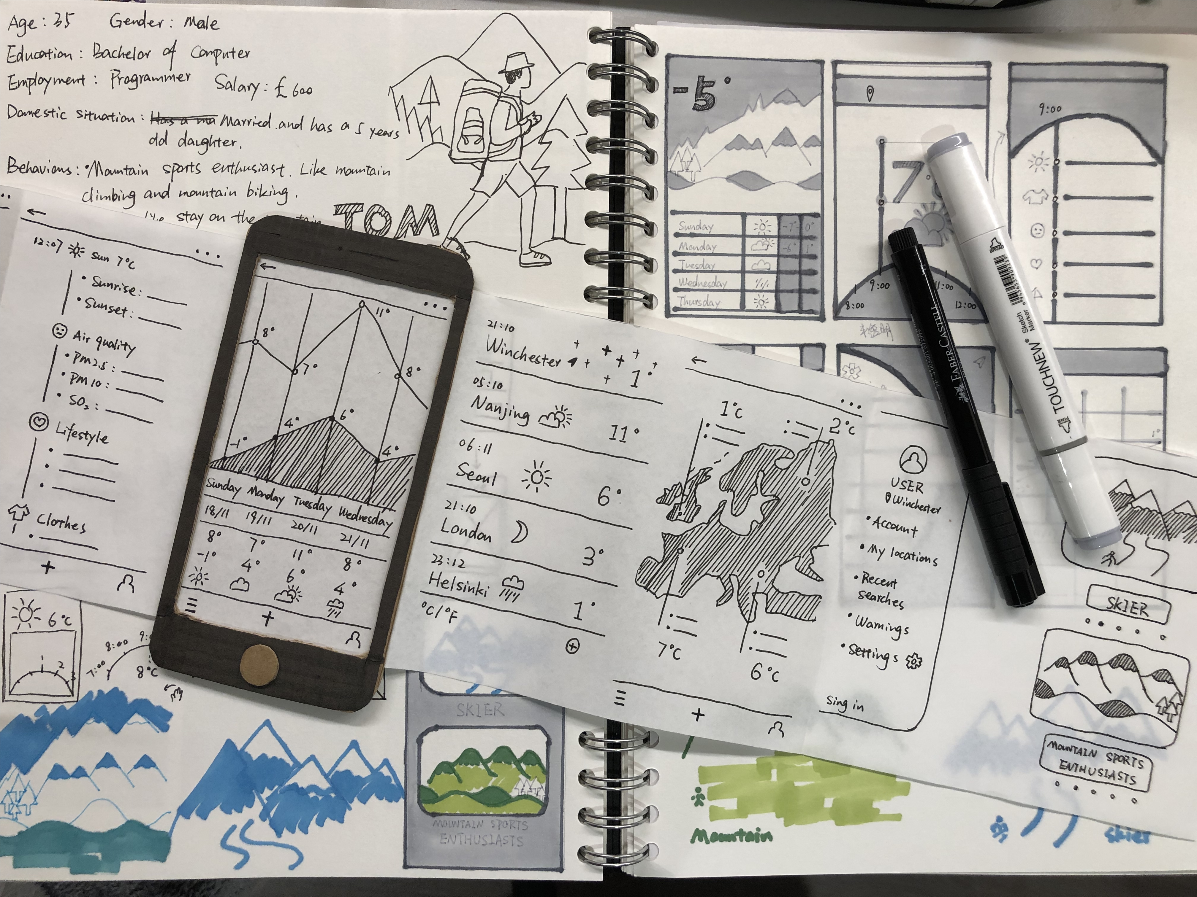
The third project is to design the weather app. In this project, we learned to make physical prototypes and paper prototypes. Through prototyping and user testing, we can develop ideas and test quickly in the early stages. The advantage of paper prototypes is that they help designers better understand users’ needs and emotions, even if the test fails, we can quickly give up on the next idea.
Physical prototypes and Paper prototypes
The fourth project is the development of the third project. We need to select a machine and control it through app. In this project, we need to integrate what we have learned in this semester. From preliminary user research, information collection, to prototype testing, then final outcome is pixel-perfect mock-ups. This project contains the knowledge we have learned in the whole semester. Also I learned to use adobe XD to make app interfaces which made me happy.
I – Interpret the events
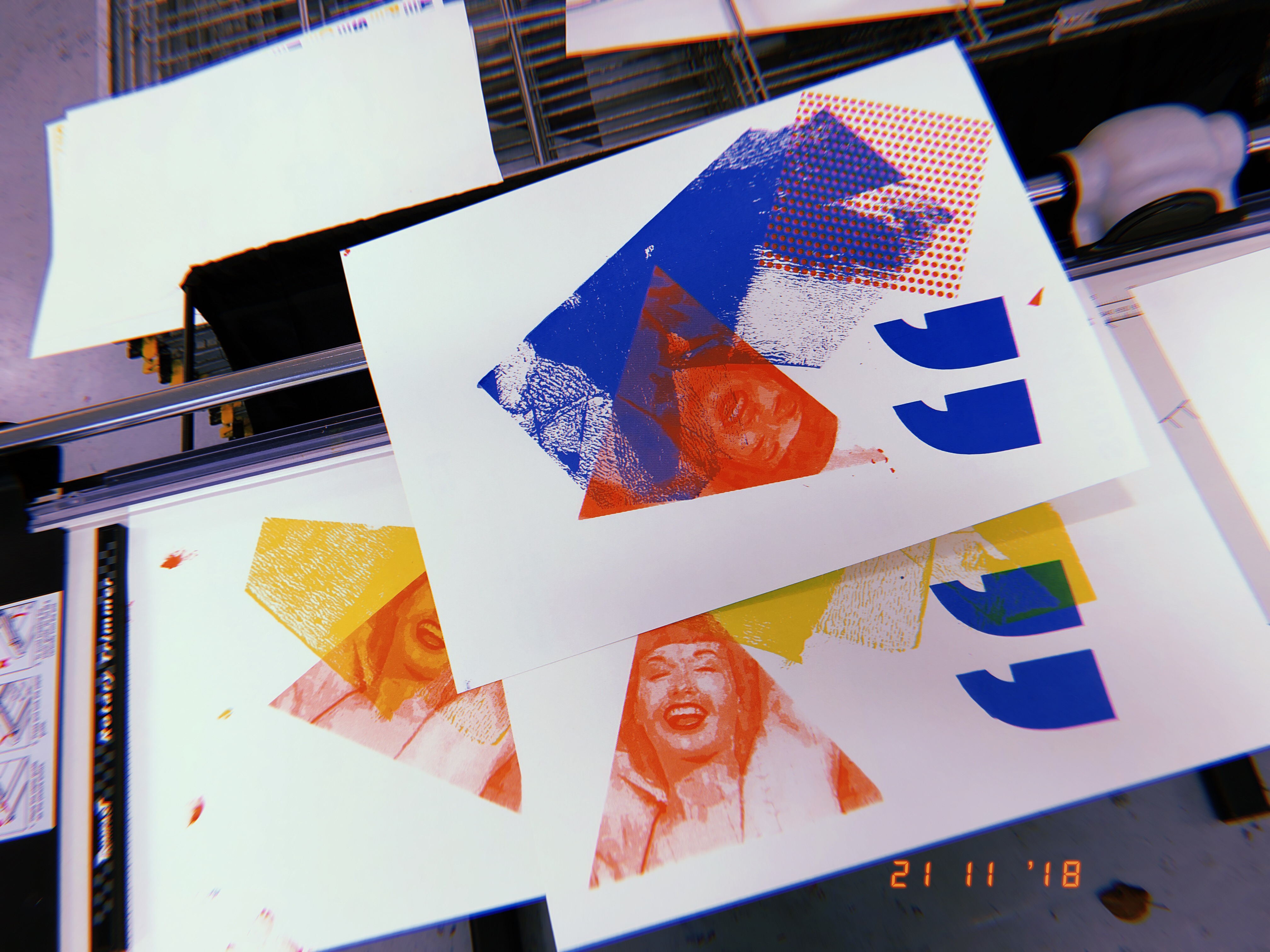
In this semester, I attended some workshops and got exposed to some printing techniques that I had never been exposed to before. Such as, Riso printing and screen printing. These printing techniques allow books and posters to be presented in a better form.
Riso Printing
Screen Print
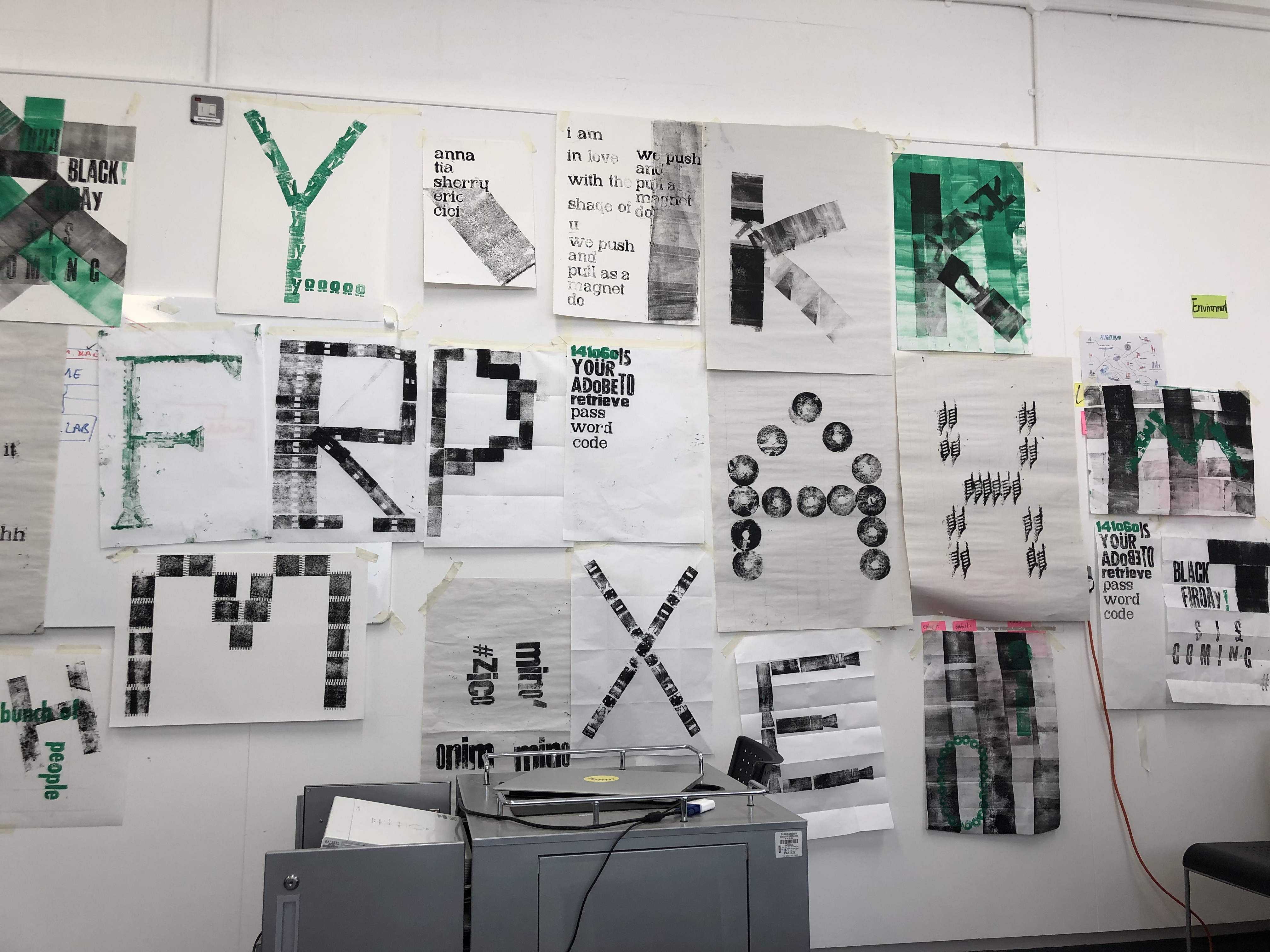
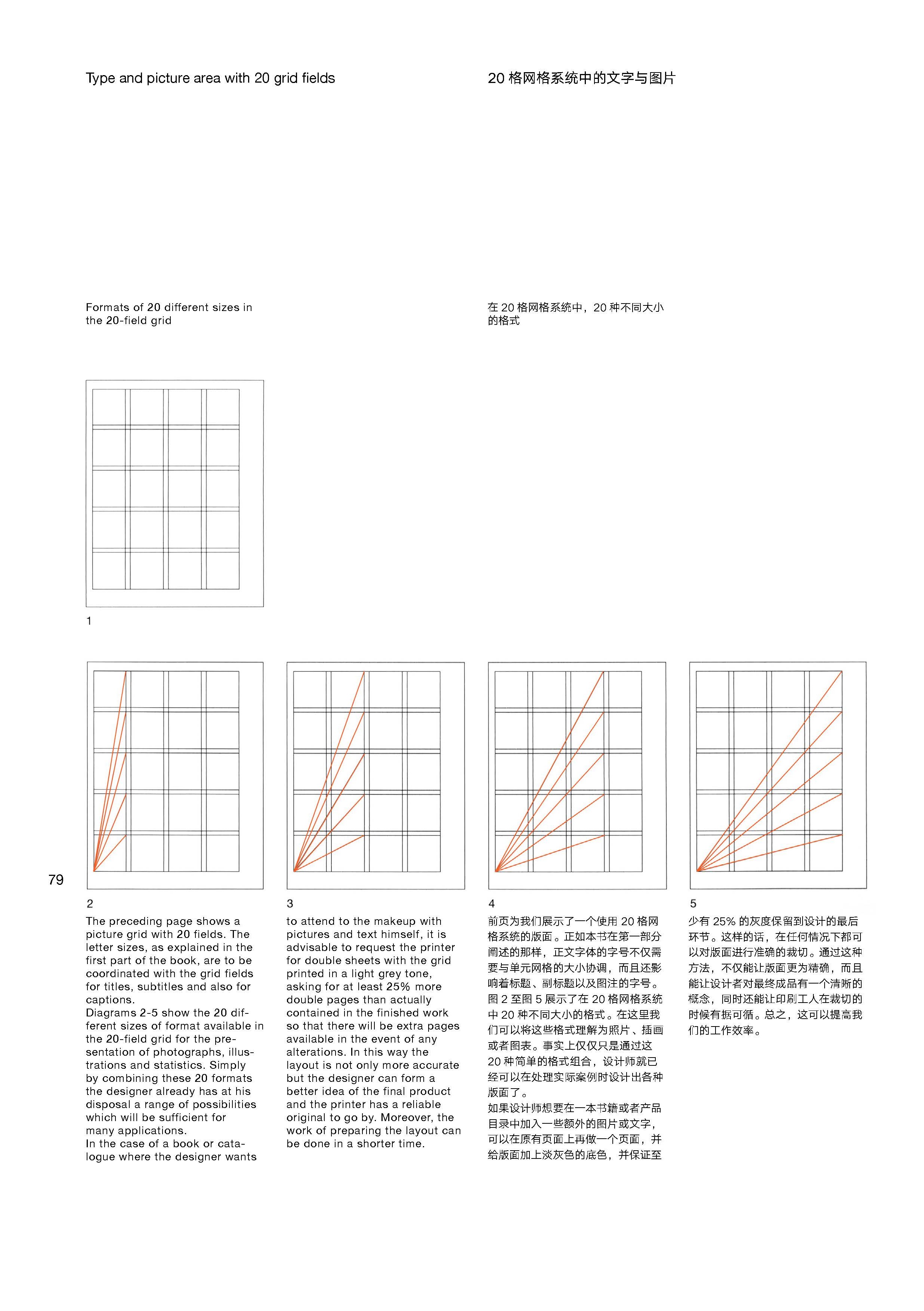
I also attended the letterpress printing workshop. In this workshop, we learned about the grid system and completed font layout by drawing the grid. After class, I read Grid systems in graphic design, the author is Josef Müller-Brockmann. Knowing that the grid system is used for typography shows that the designer conceived and designed in a structured and predictable way. At the same time, it will make the layout designed more direct, clear and easy to understand.
letterpress printing
At the end of the semester, I participated in the coding emotions workshop. This is a very interesting workshop, which use code to enrich web design make website more interesting. Although I can only learn some basic knowledge from the workshop, because programming is very complicated. However, I was very happy and excited to see the finished product after the final modification of the code given by the teacher. However, after the final revision of the code given by the teacher, I was still very happy and excited to see the finished product.
Coding emotions
E – Evaluate what you learned
What I have learned in this semester makes me feel that I am one step closer to user experience design. In the previous projects of the semester, we had to work as a team to complete the project. Let me know how important teamwork is, sharing ideas and knowledge with others can help you think more widely and get more ideas. And everyone has their own good points, we can learn from each other.
When I started the last project about app design, I found that all the knowledge I used was acquired through the previous several projects. I need to combine what I have learned before to complete this project. At the same time, I also found some of my shortcomings. If I had more time, I might have done more user research to make personas and user experience maps more complete. After all, user information is very important. I also hope my English level can be improved, don’t be afraid to communicate with others in English, if I can speak English more confidently, I believe I can get more useful knowledge.
P – Plan how this learning will be applied
The knowledge I gained in this semester is about design thinking. Such as, establish empathy and understand the emotional experience of users, prototyping, user test and tolerance for failure. All of these will play an important role in my future career because any knowledge is useful. These knowledge can lay a foundation for my future career and life, so that I can have more career choices. I hope I can continue to work on design in the future and become a designer. Because design is a very interesting process, there will be a sense of achievement. Then I also hope that I can use my knowledge to teach students to be a teacher. This is a career wish that seems unreachable now. However, I believe that with every step of my efforts and continuous accumulation of knowledge, I can gradually achieve my goal.
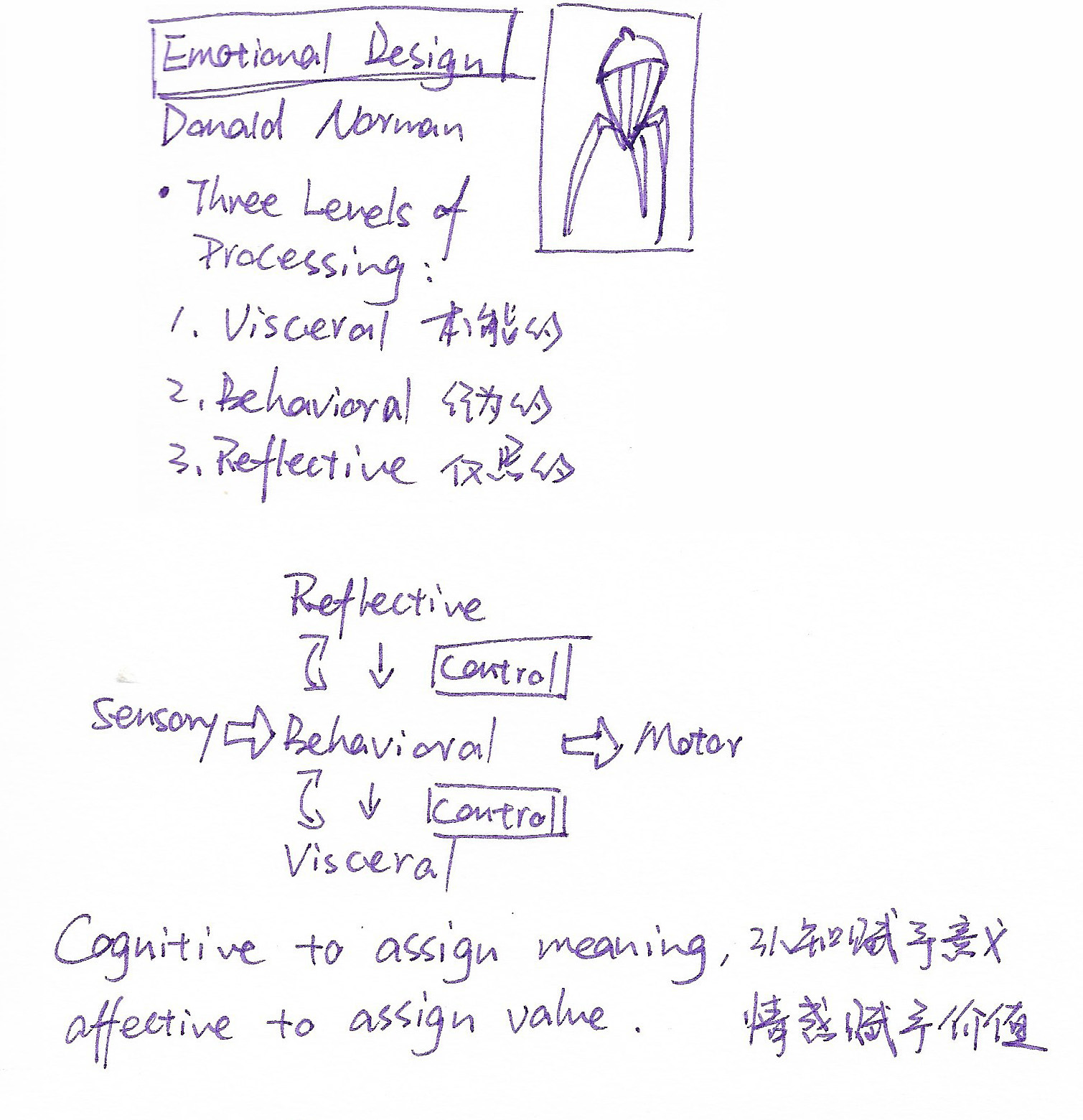
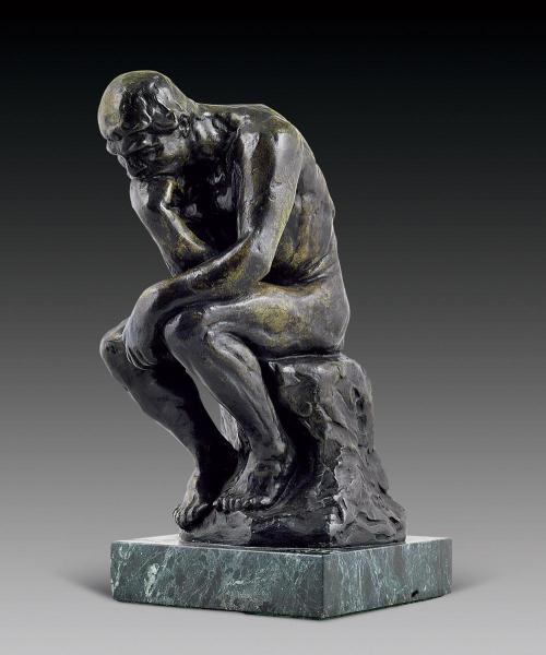
The contemplative part of the brain, where you recall the past, envision the future, and introspect to better organize your present activities, is called the reflective level.
The Thinker (Le Penseur) —Auguste Rodin, 1902
Focus and Creativity
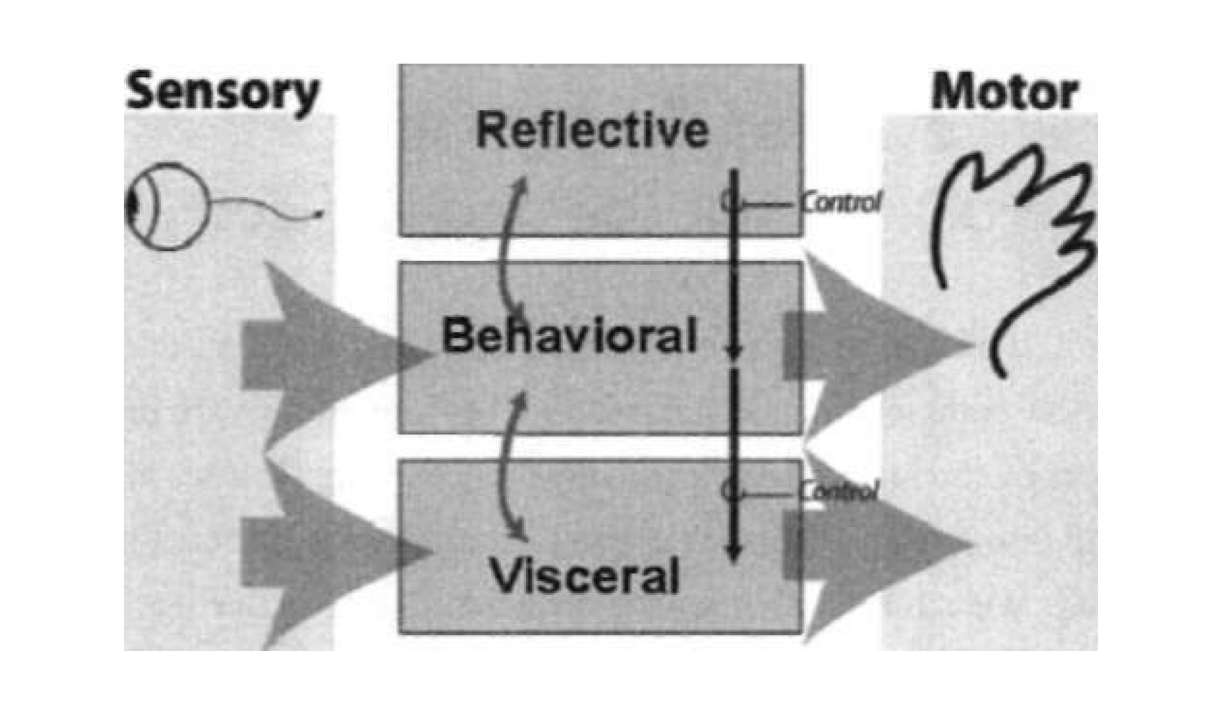
The three levels interact with one another, each modulating the others. Bottom-up processes are those driven by perception whereas top-down are driven by thought. Everything you do has both a cognitive and an affective component—cognitive to assign meaning, affective to assign value.
The visceral level is fast: it makes rapid judgments of what is good or bad, safe or dangerous, and sends appropriate signals to the muscles (the motor system) and alerts the rest of the brain. This is the start of affective processing. These are biologically determined and can be inhibited or enhanced through control signals from above. The behavioral level is the site of most human behavior. Its actions can be enhanced or inhibited by the reflective layer and, in turn, it can enhance or inhibit the visceral layer. The highest layer is that of reflective thought. Note that it does not have direct access either to sensory input or to the control of behavior. Instead it watches over, reflects upon, and tries to bias the behavioral level.
Modified from a figure by Daniel Russell for Norman, Ortony, & Russell, 2003.
Emotional states, whether positive or negative, change the way we think. When people are in a negative emotional state, feel anxious or in danger, they tend to focus on a topic, undisturbed, and then continue to dig into the topic until they reach a solution, for example, deadlines for assignments. If people are in a highly negative mood, they are so focused on escaping that they don’t see any obvious alternative. When people are in positive emotions, curiosity is stimulated, creativity is stimulated, and the brain becomes an effective learning organism.
The Prepared Brain
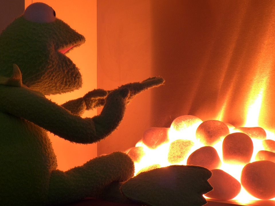
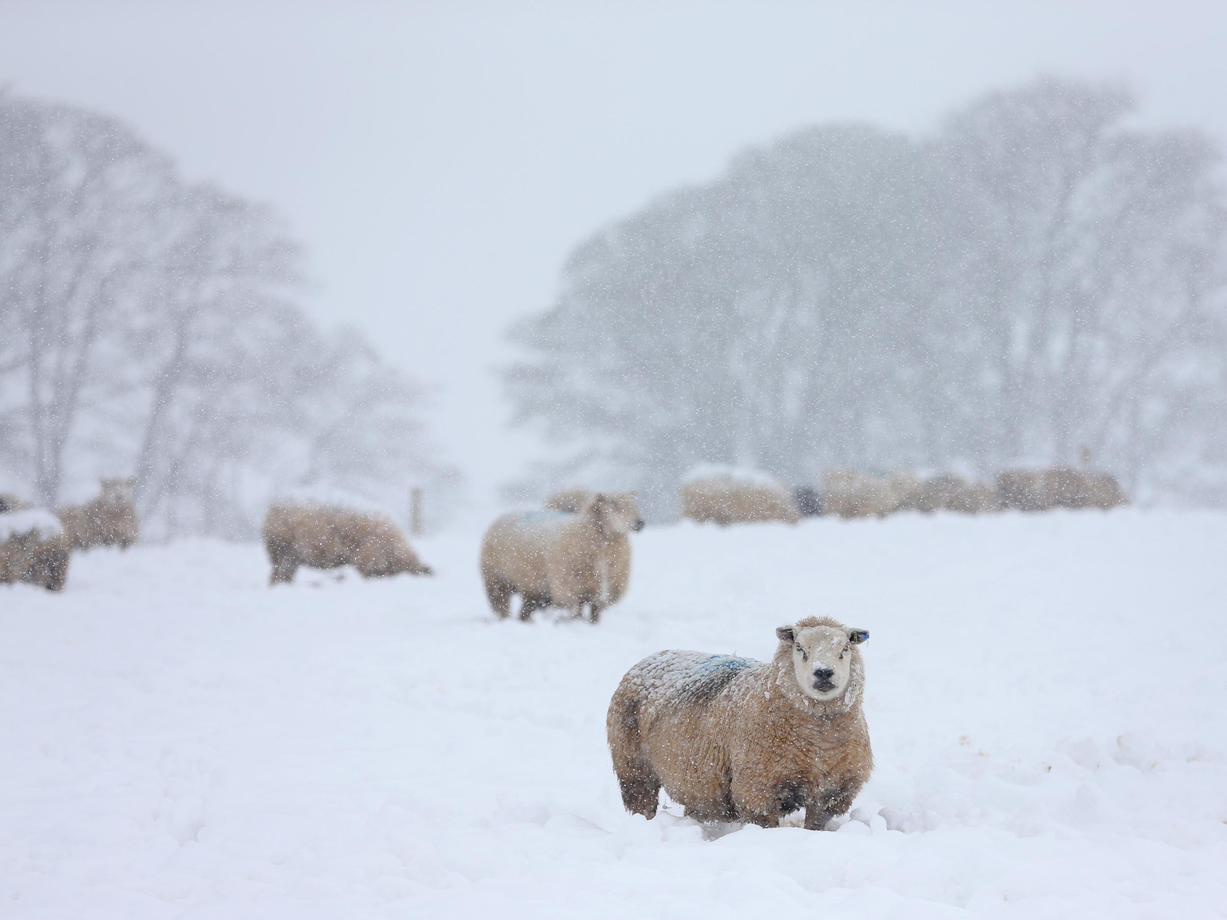
Providing food, warm or protected environments and objects can have a positive impact on people. On the contrary, darkness, cold, loud noise, strong light and nausea and dizziness can lead to negative emotions.
Emotions, moods, traits, and personality are all aspects of the different ways in which people’s minds work, especially along the affective, emotional domain. The human mind is incredibly complex, and although all people have basically the same form of body and brain, they also have huge individual differences. One person’s acceptance is another one’s rejection.
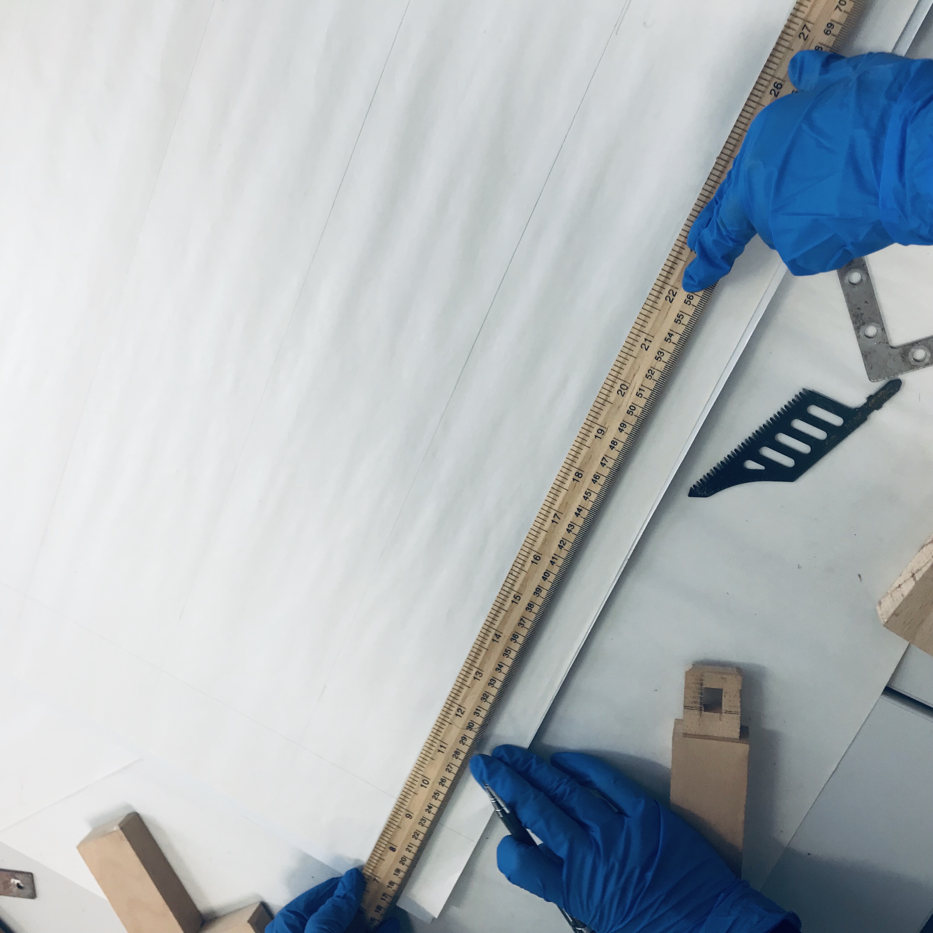
At the workshop in week 8, we split up into different groups to explore the typographic arrangements, through building grid systems, and then using different graphics to create a typeface.
Workshop
By using grid system, we find that with the help of grid system, we can solve problems in the design more quickly and make the design more functional, logical and also more aesthetically pleasing.
Creating a grid system
In book and poster typesetting, if designer want to find a layout that can meet all the requirements in the design, the best way is to draw small sketches, and constantly revise and improve. When drawing sketches, there are many elements need to consider, such as, the format, the text and illustrations, the typeface, the printing method and the quality of paper etc. At the same time, the number of columns on a page is one of the points to be considered (Mülller-Brockmann, 1999).
Mülller-Brockmann, J (1999) Grid Systems in Graphic Design
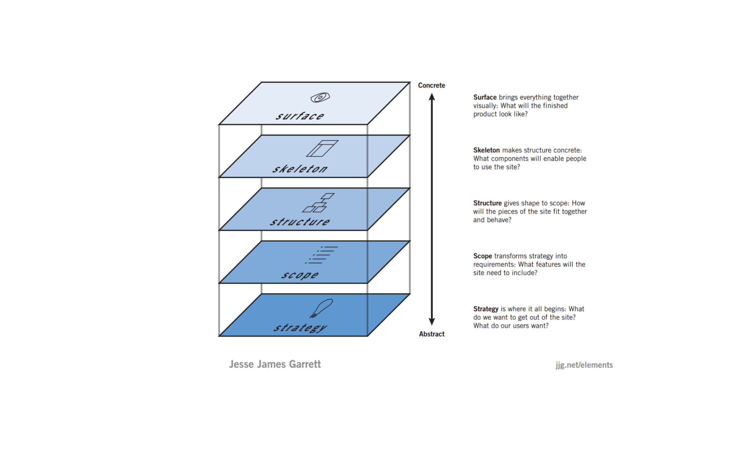
Also, there are similar theories in user experience design.
Jesse James Garrett (2010) the elements of user experience
In the modern era based on digital and screen, grid system is still suitable for web page and app design. In traditional paper-based design, the edges of the paper affect the reader’s perception, if they are too small, the reader feels the page is overfull, and he also unknowingly reacts adversely to the fact that his fingers obscure the text and pictures when he is holding the book or brochure (Mülller-Brockmann, 1999). Therefore, stable, well-proportioned edges will give people a relaxed and comfortable feeling.
Mülller-Brockmann, J (1999) Grid Systems in Graphic Design Mülller-Brockmann, J (1999) Grid Systems in Graphic Design
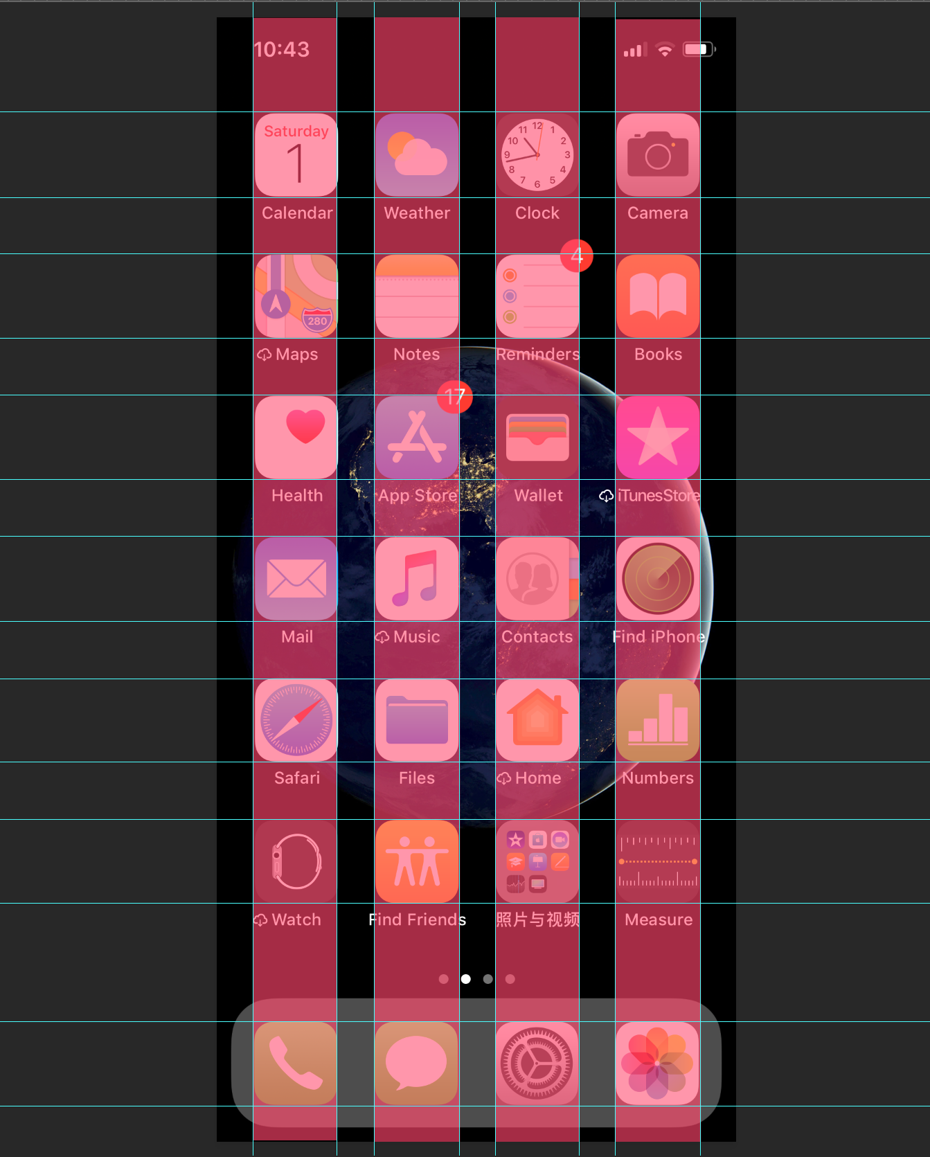
When designing a web page or app, the distance between the interface and the edge of the screen is similar like the edges of the paper. Also, there are many similar knowledge that can be converted and applied to each other:
Draw sketches
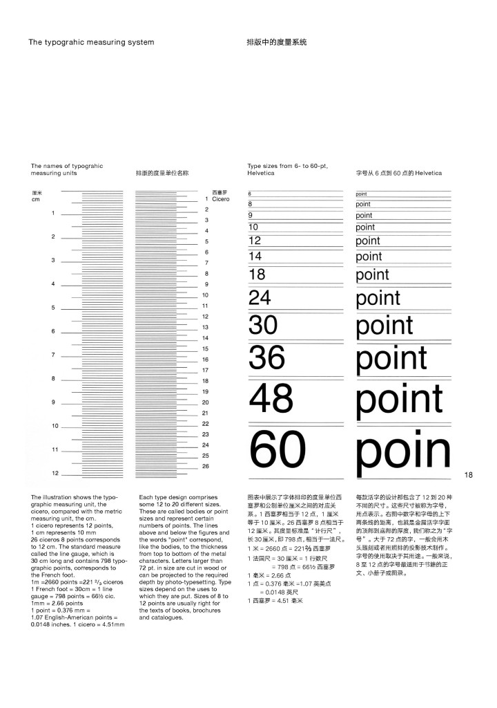
Font and font size
The size of the font depends on the width of the column, which means that the narrower the column, the smaller the font size.
Font sizeFont
The number of columns on a page
In print, for the layout that needs to be mixed with pictures and texts, four columns is a better way to divide columns. On the screen of mobile phone, we can often find four-column layout design, such as the desktop of ios system.
Mülller-Brockmann, J (1999) Grid Systems in Graphic Designios sysyem